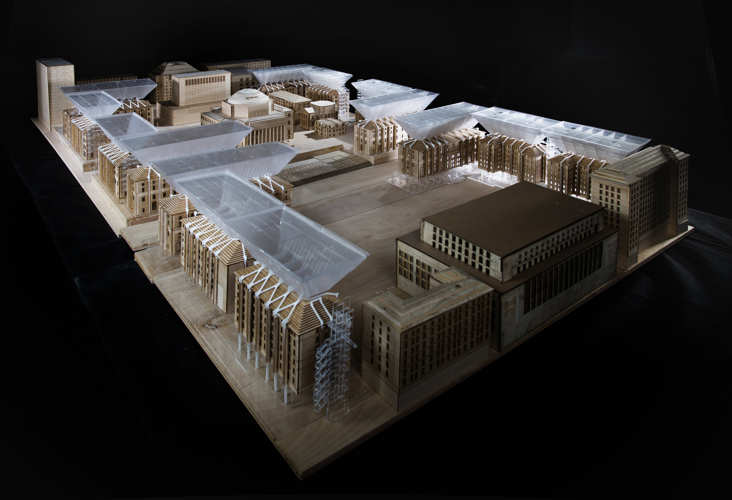
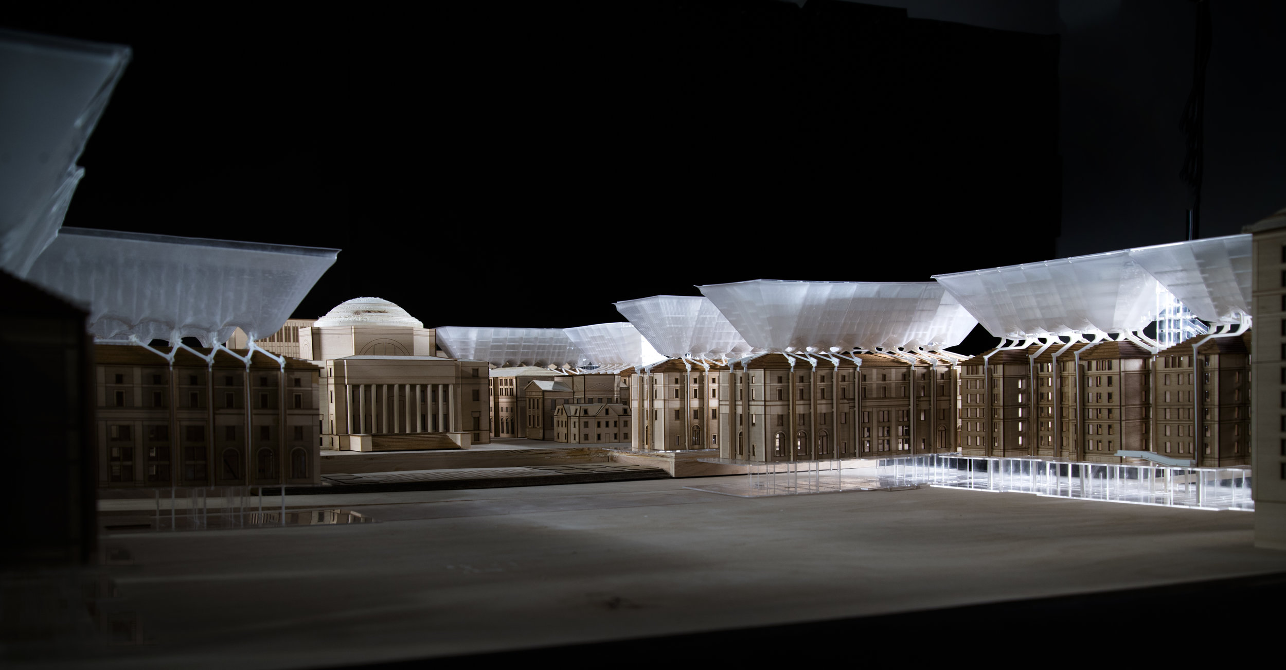
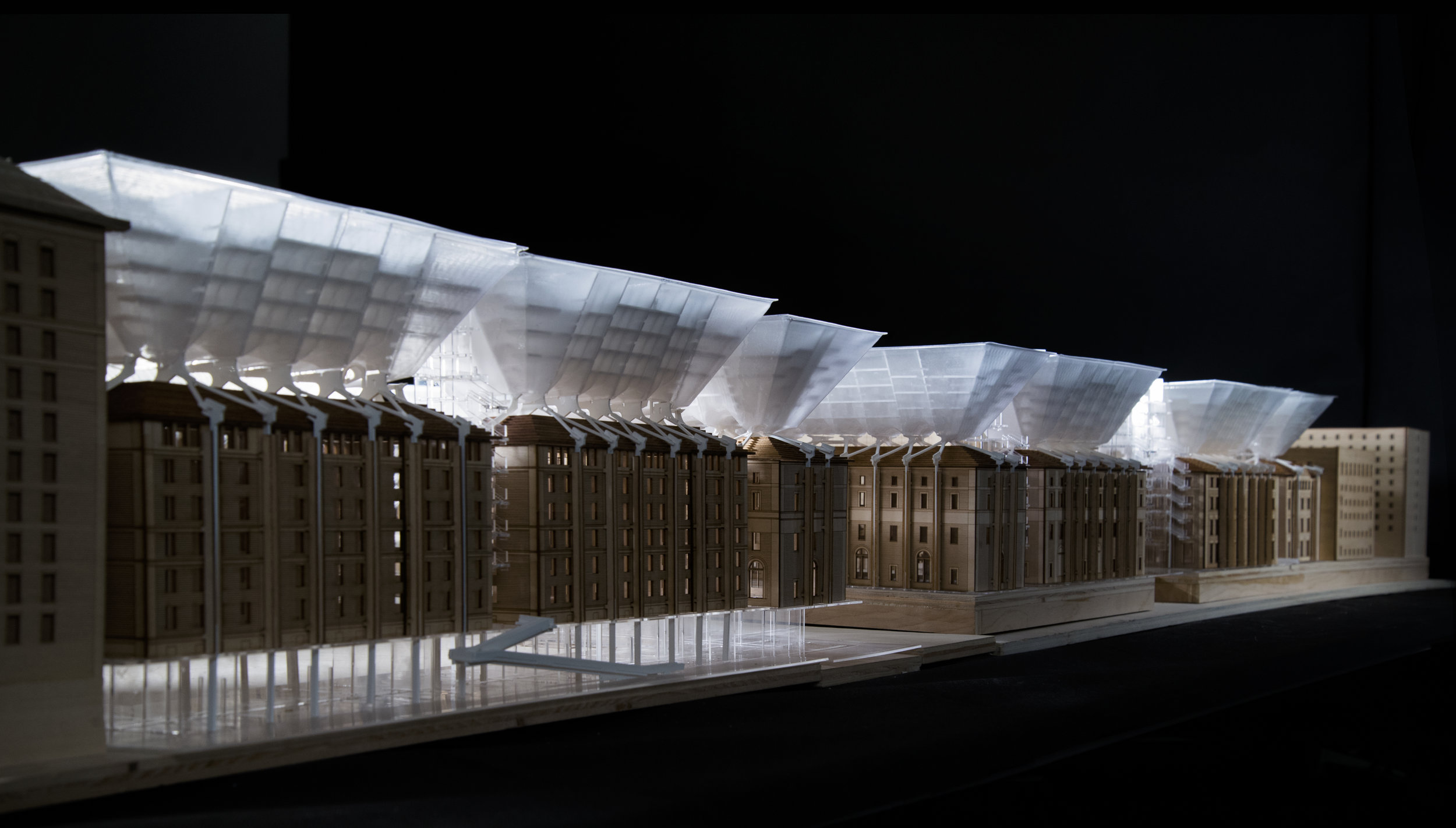
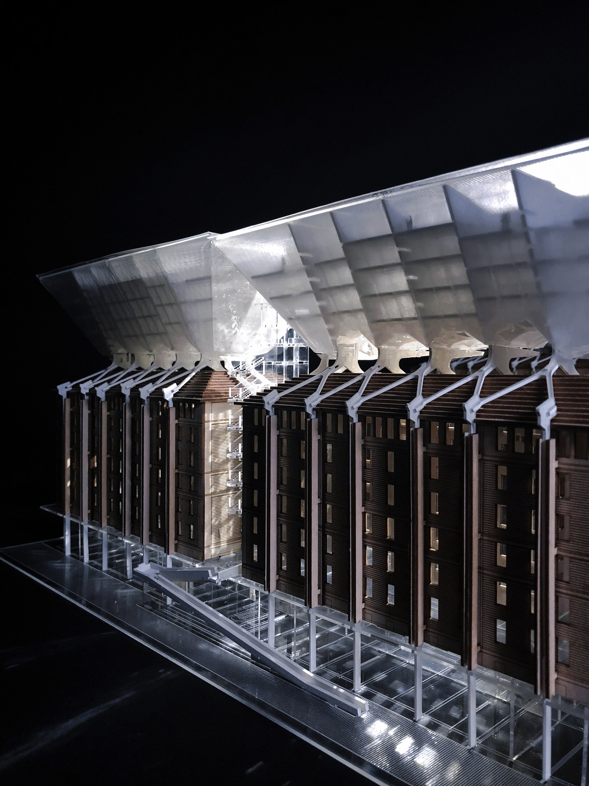
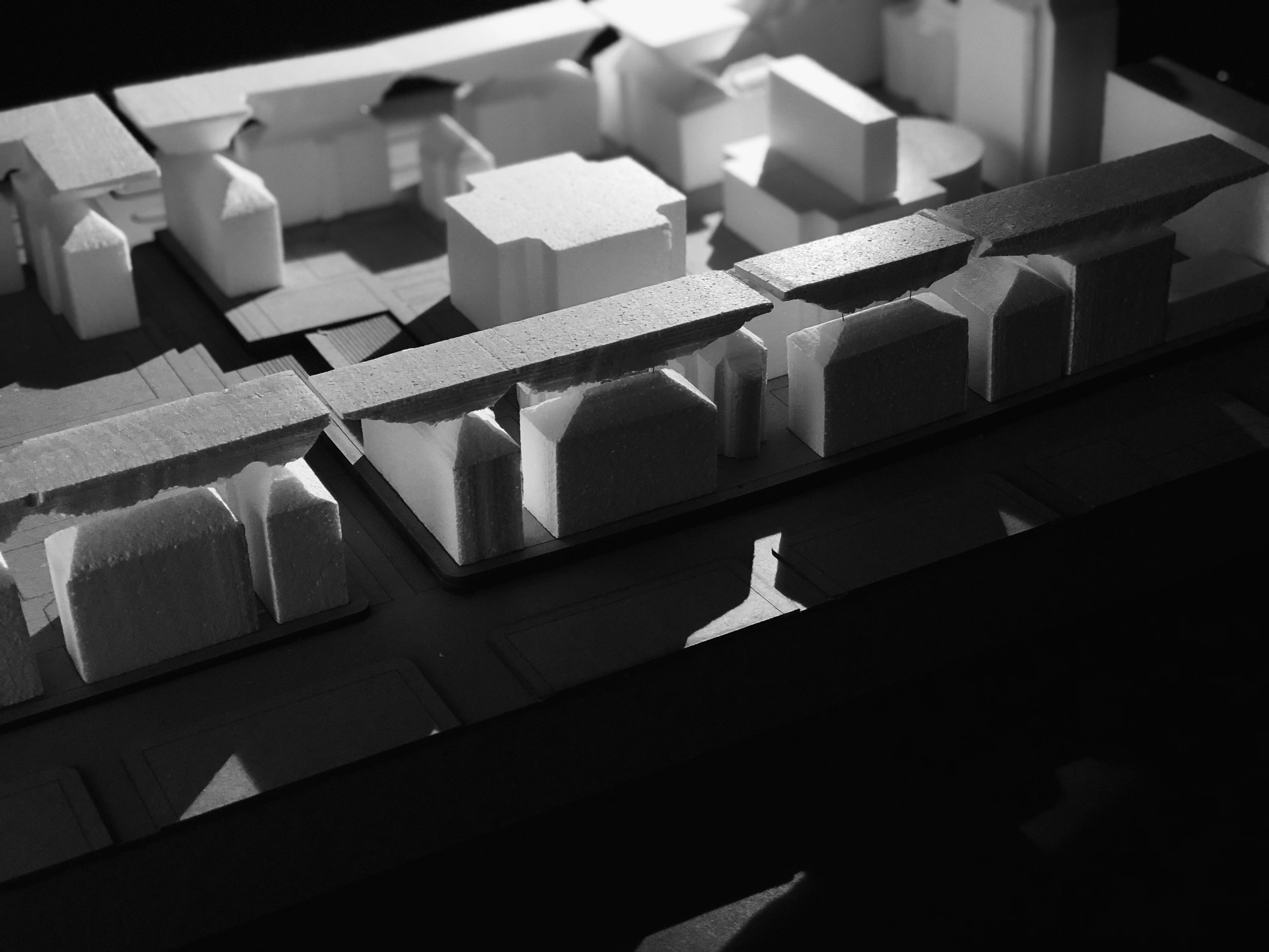
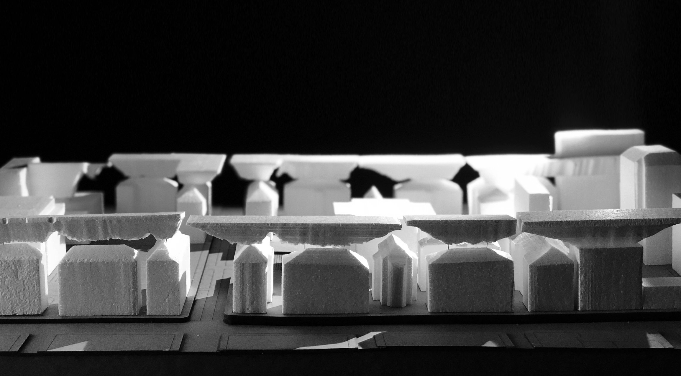
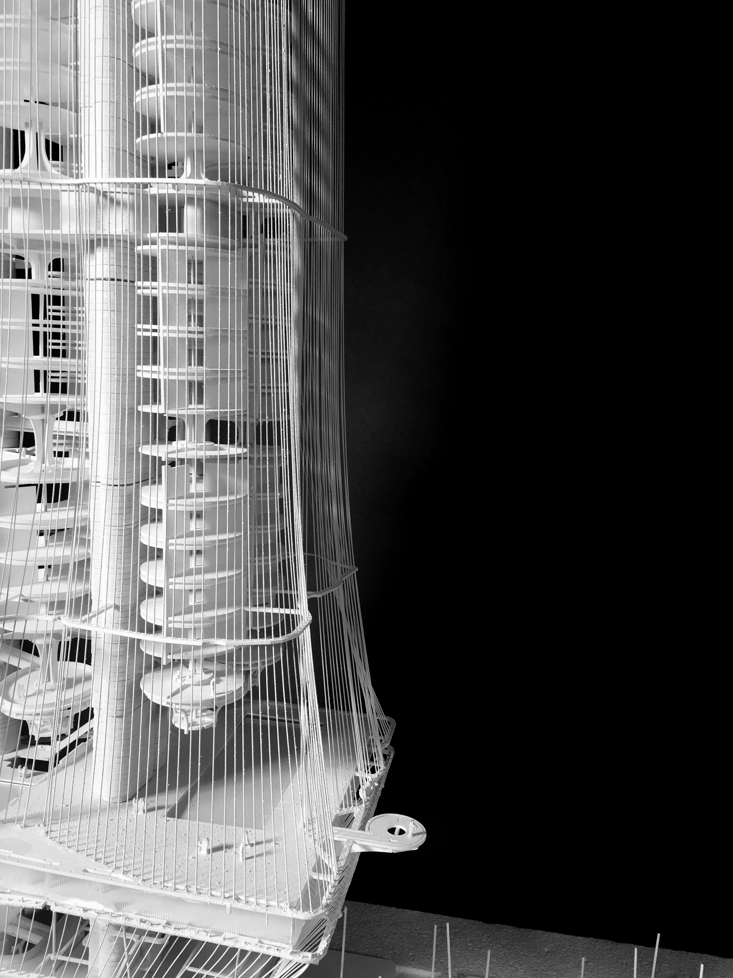
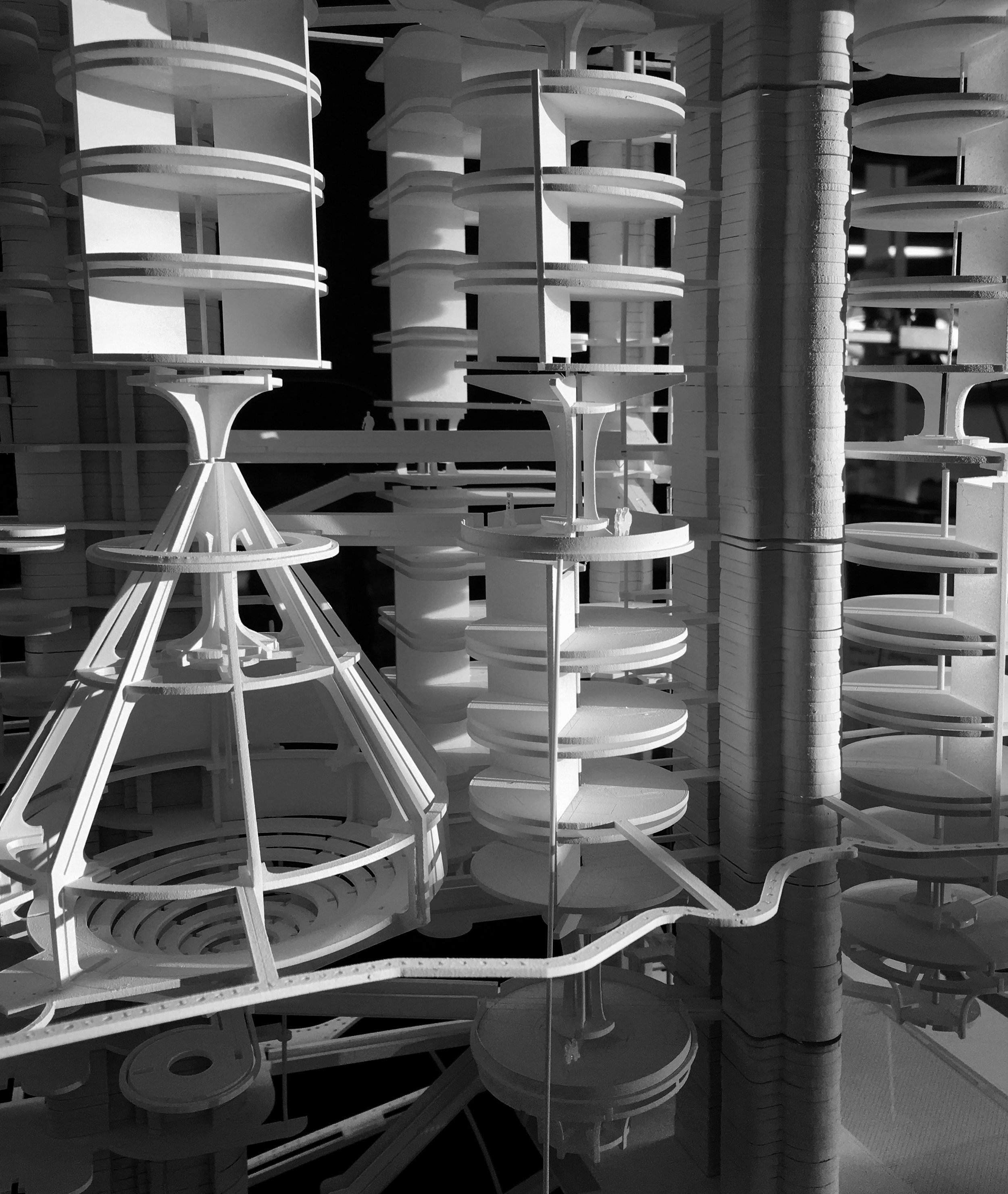
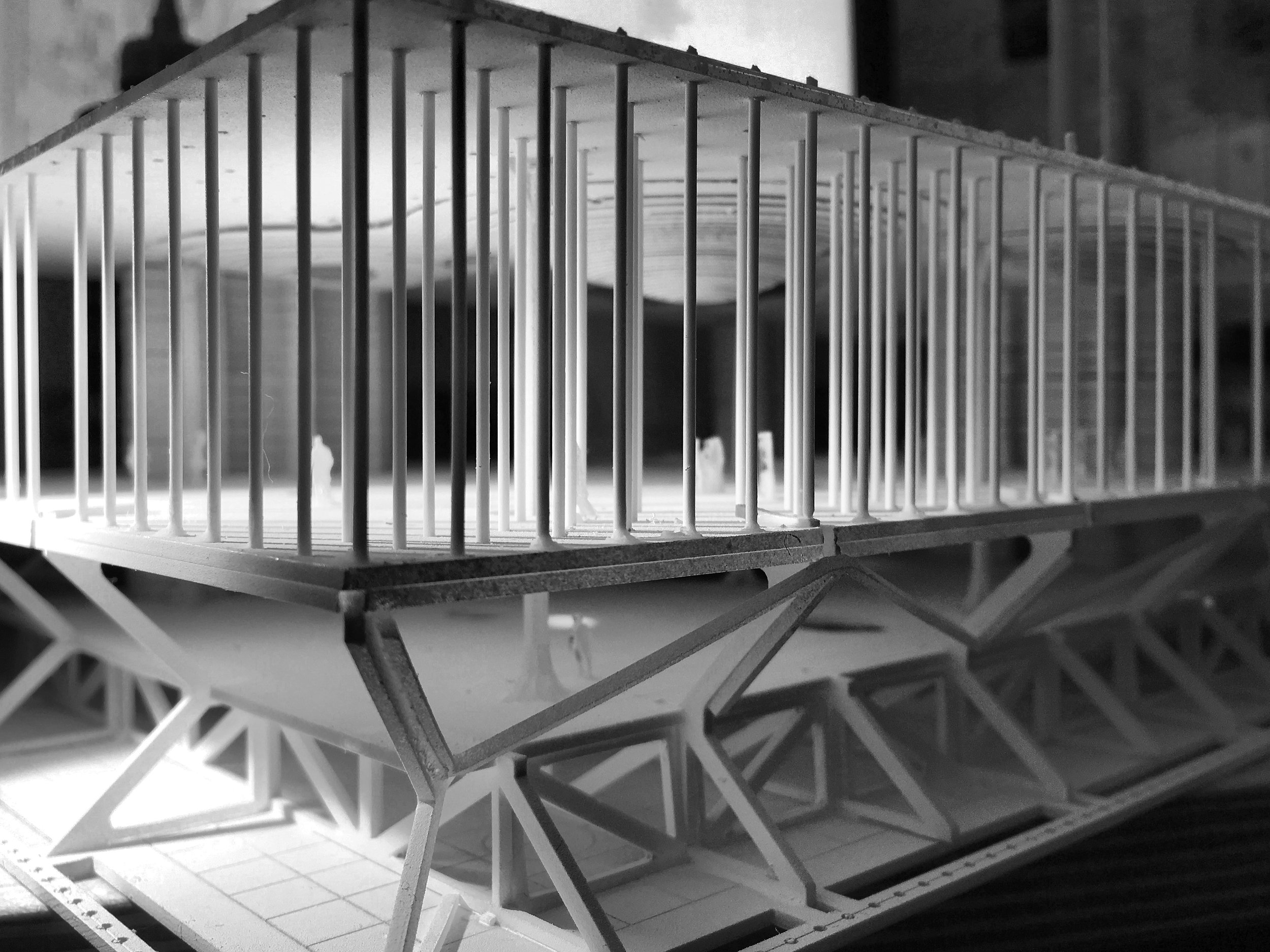
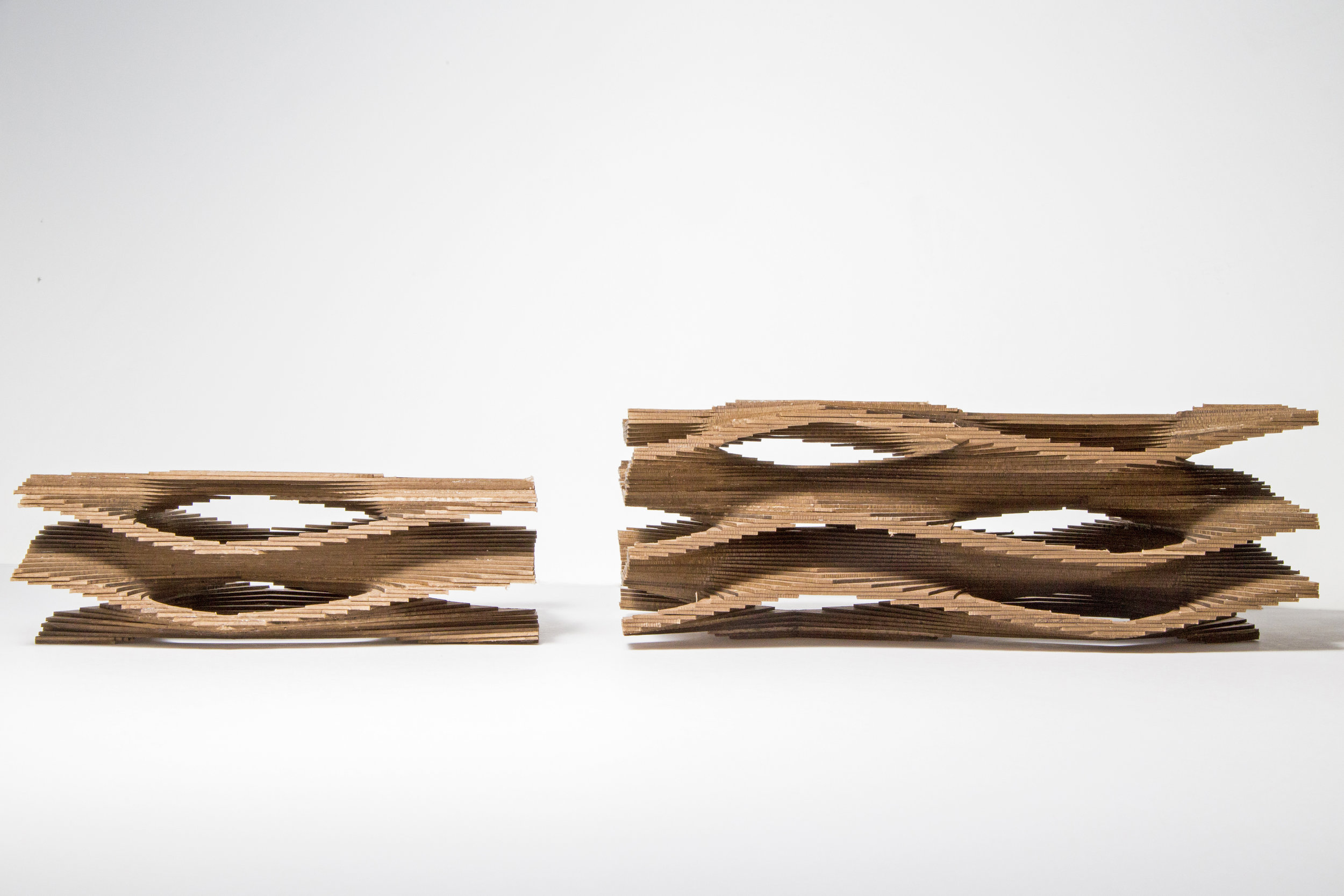
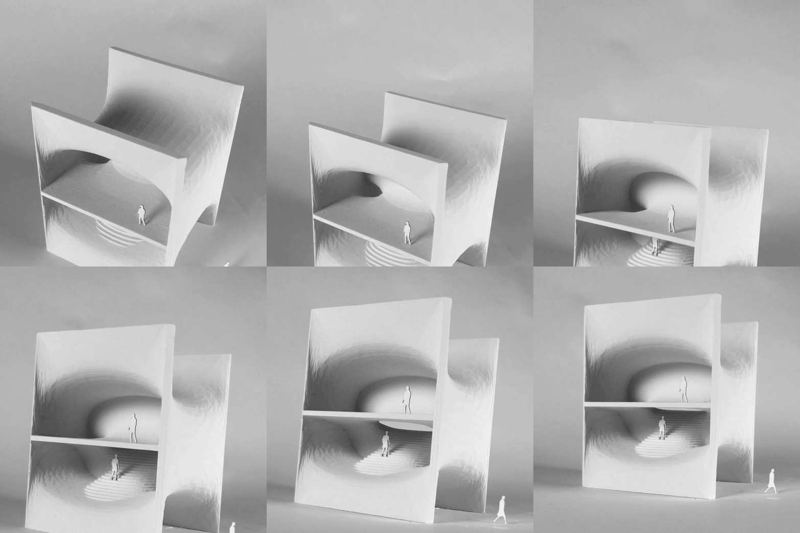
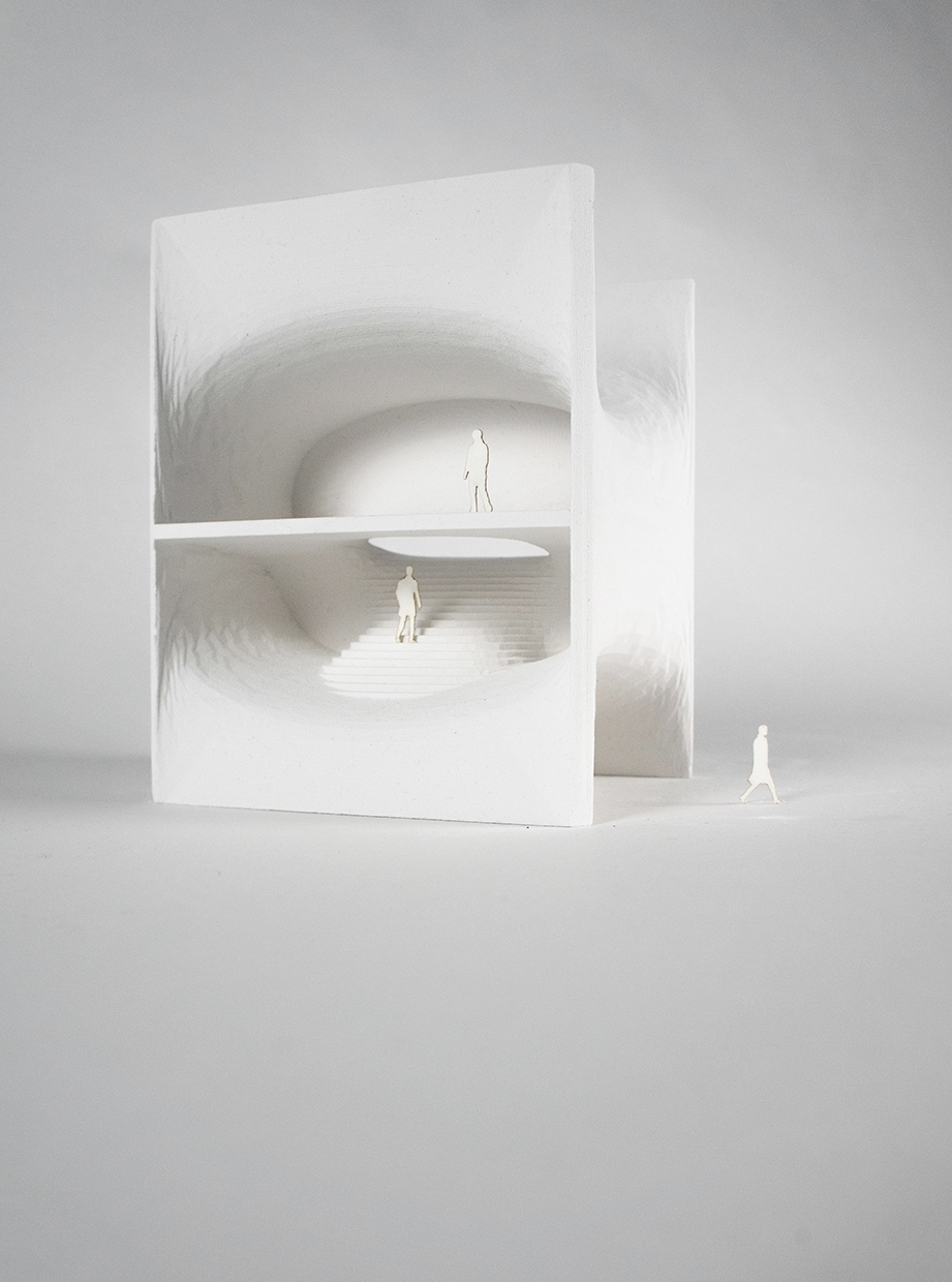
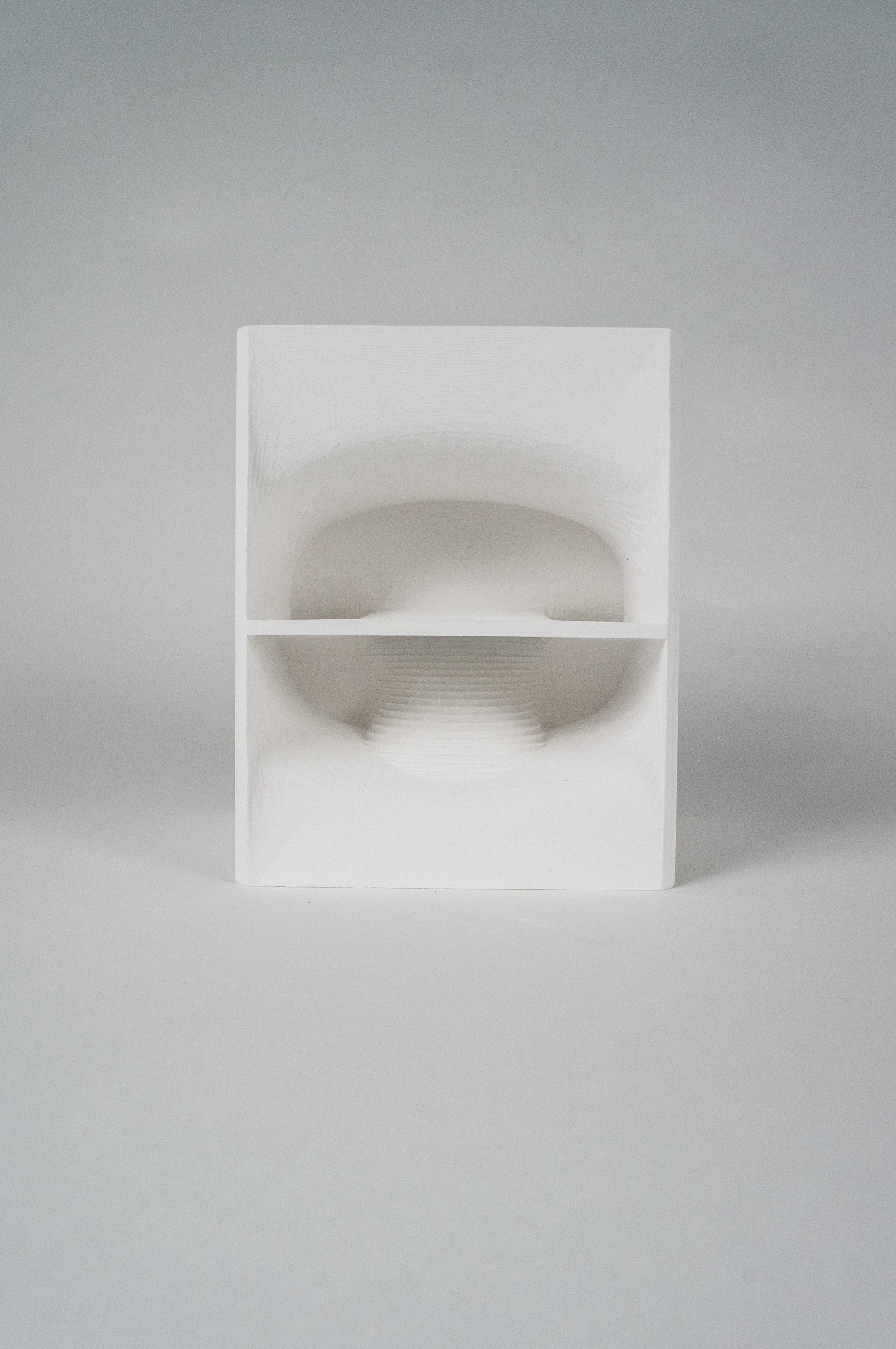
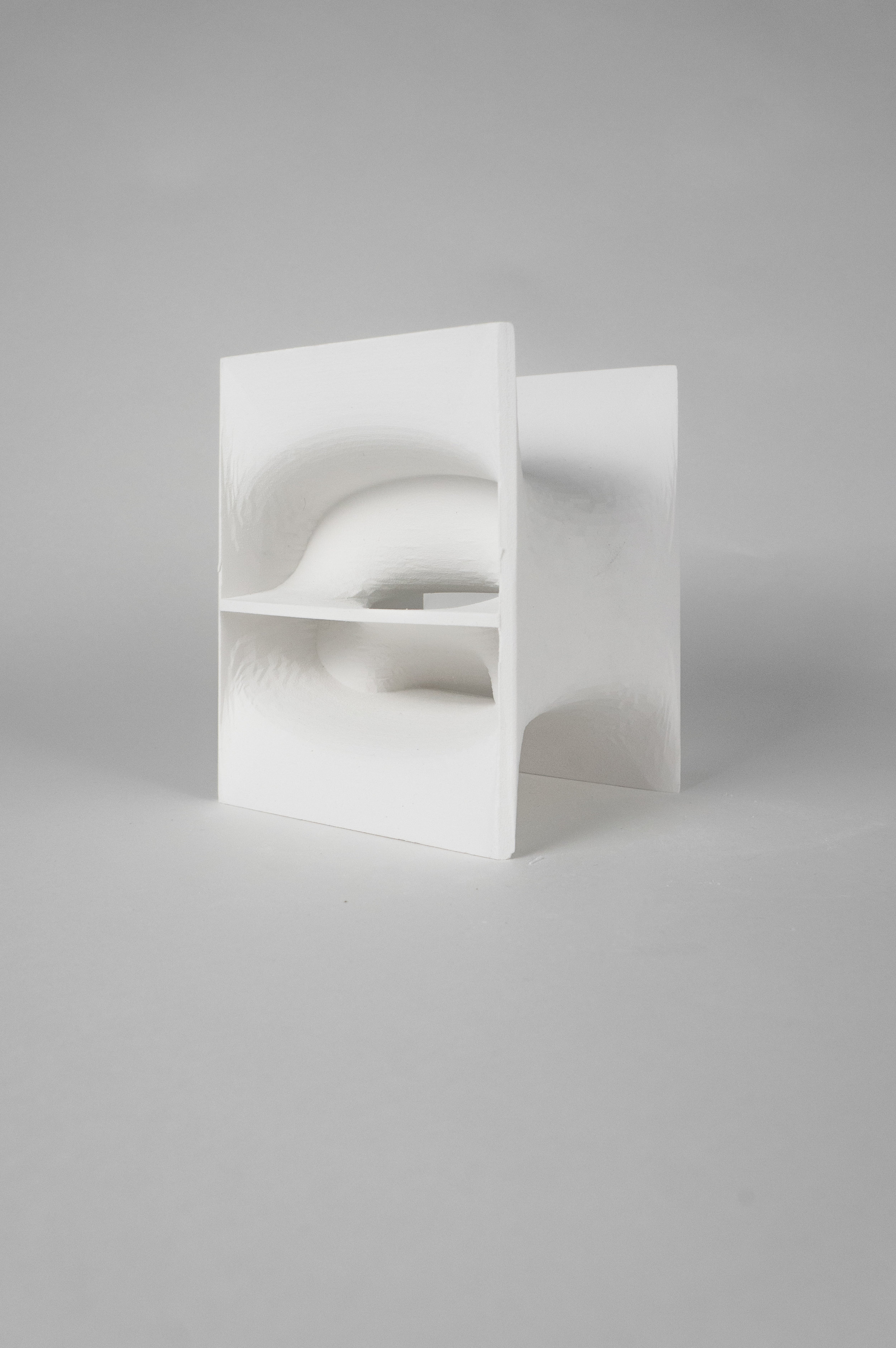
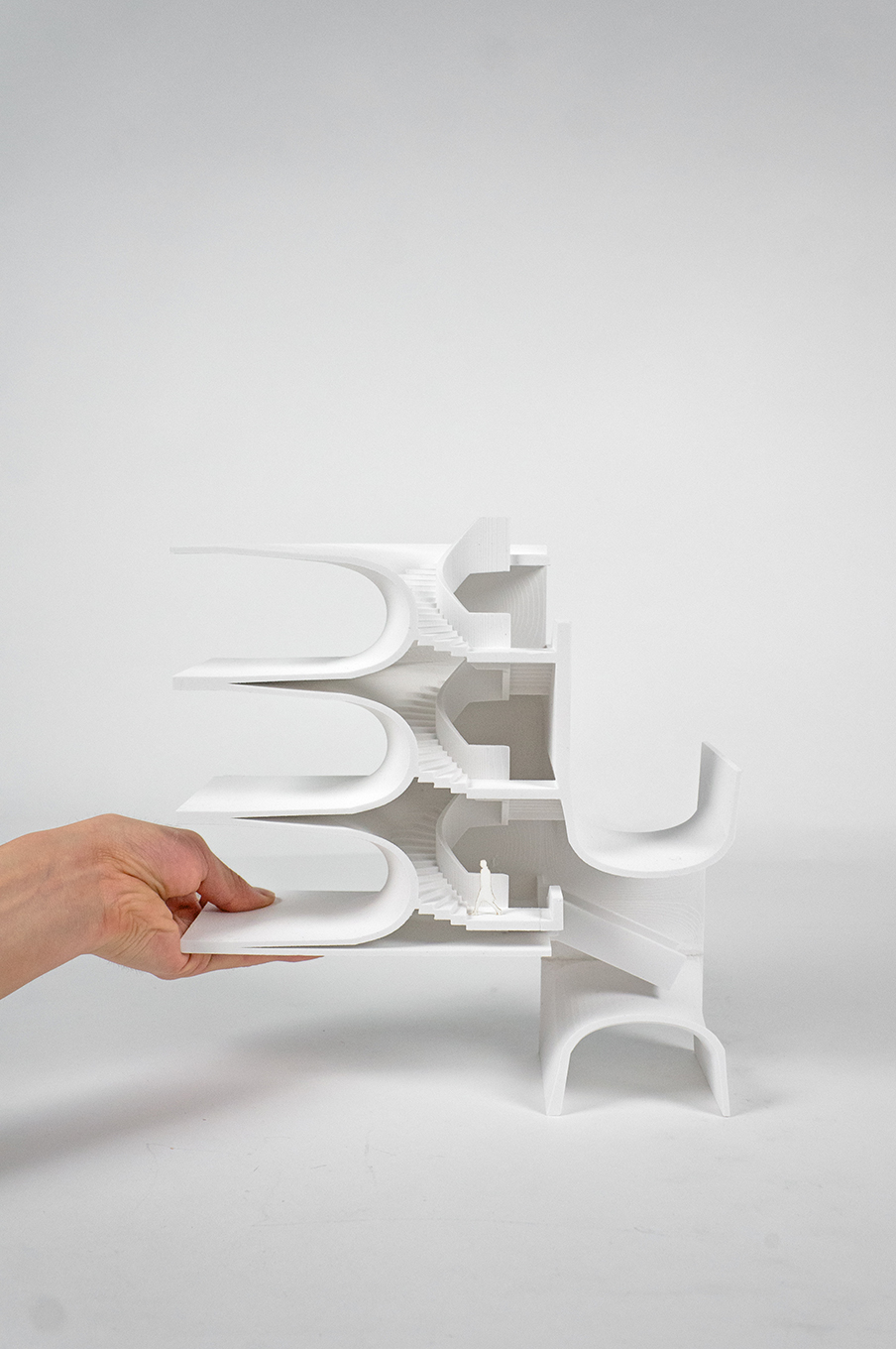
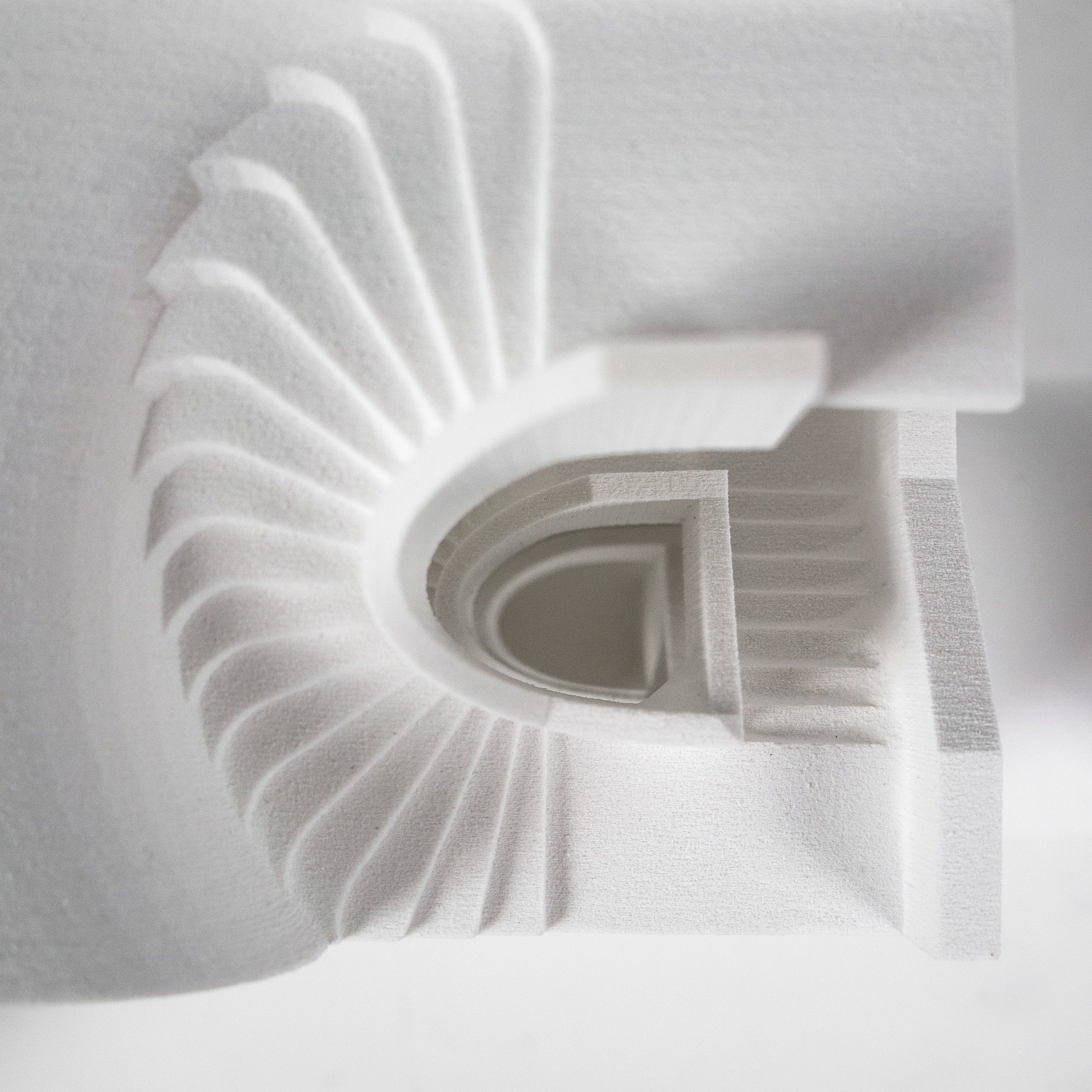
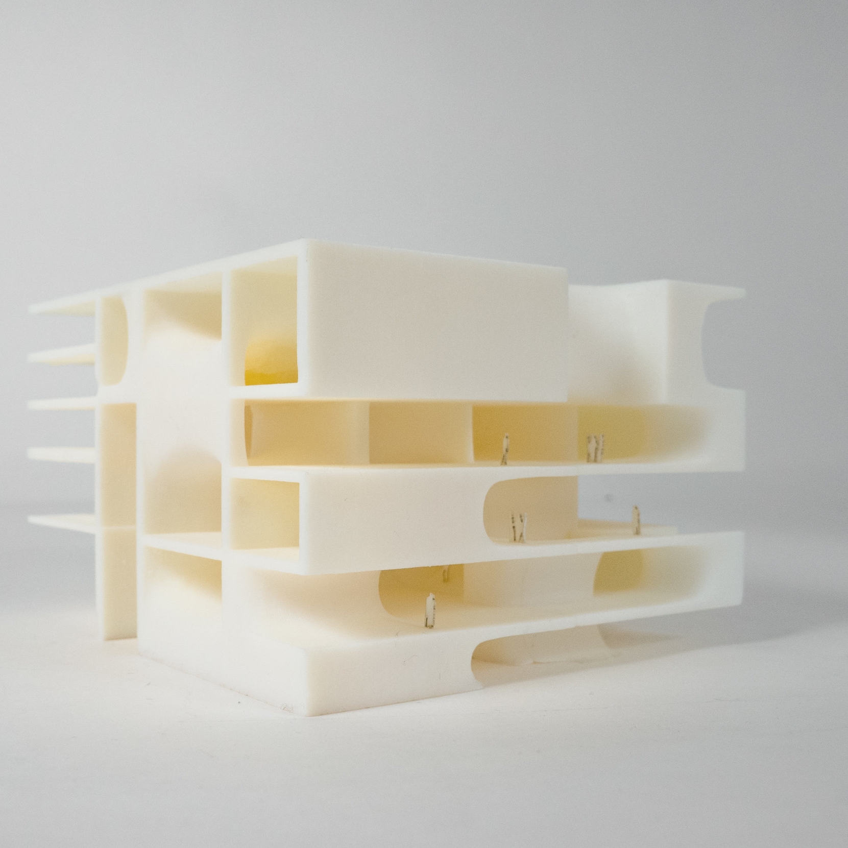
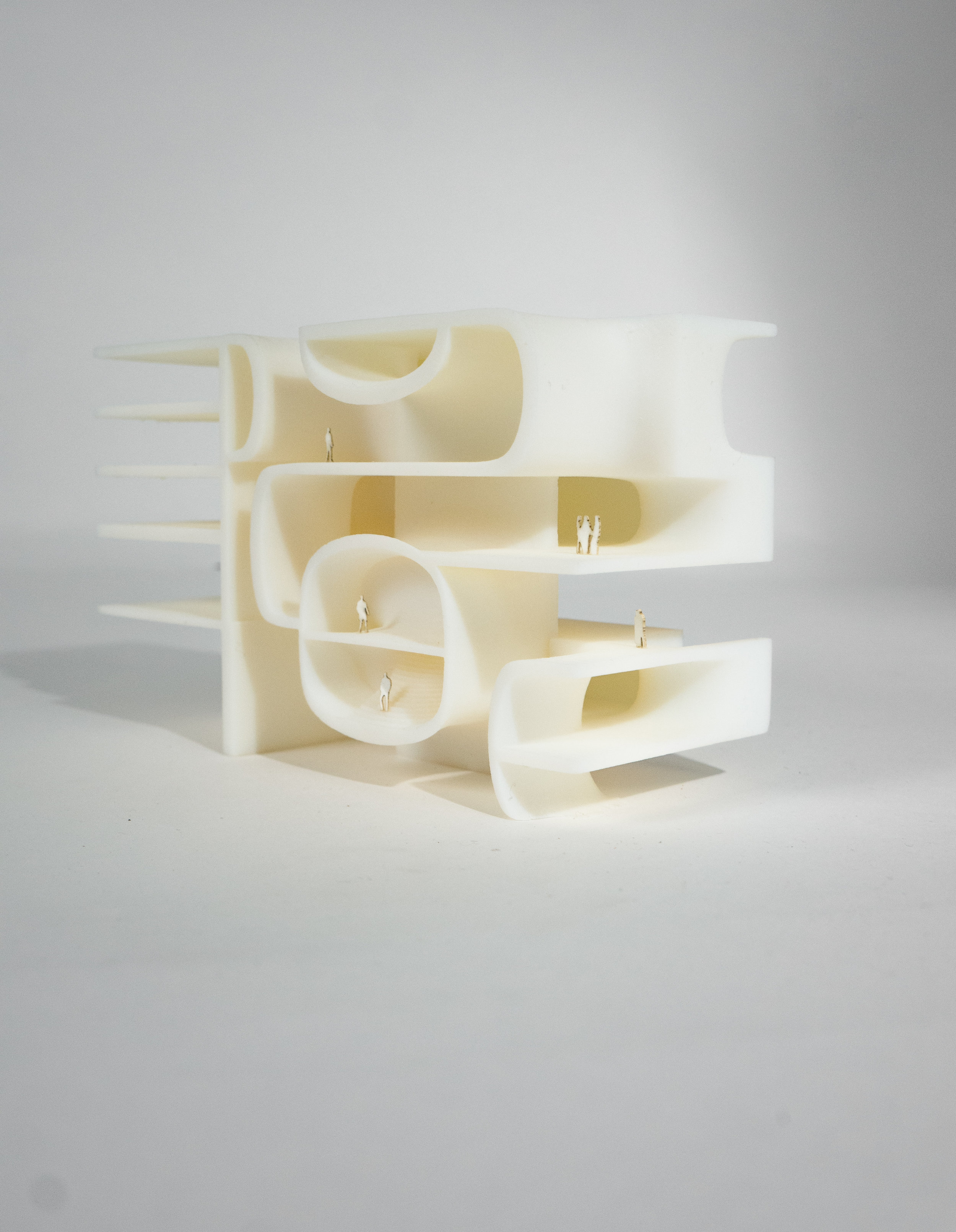
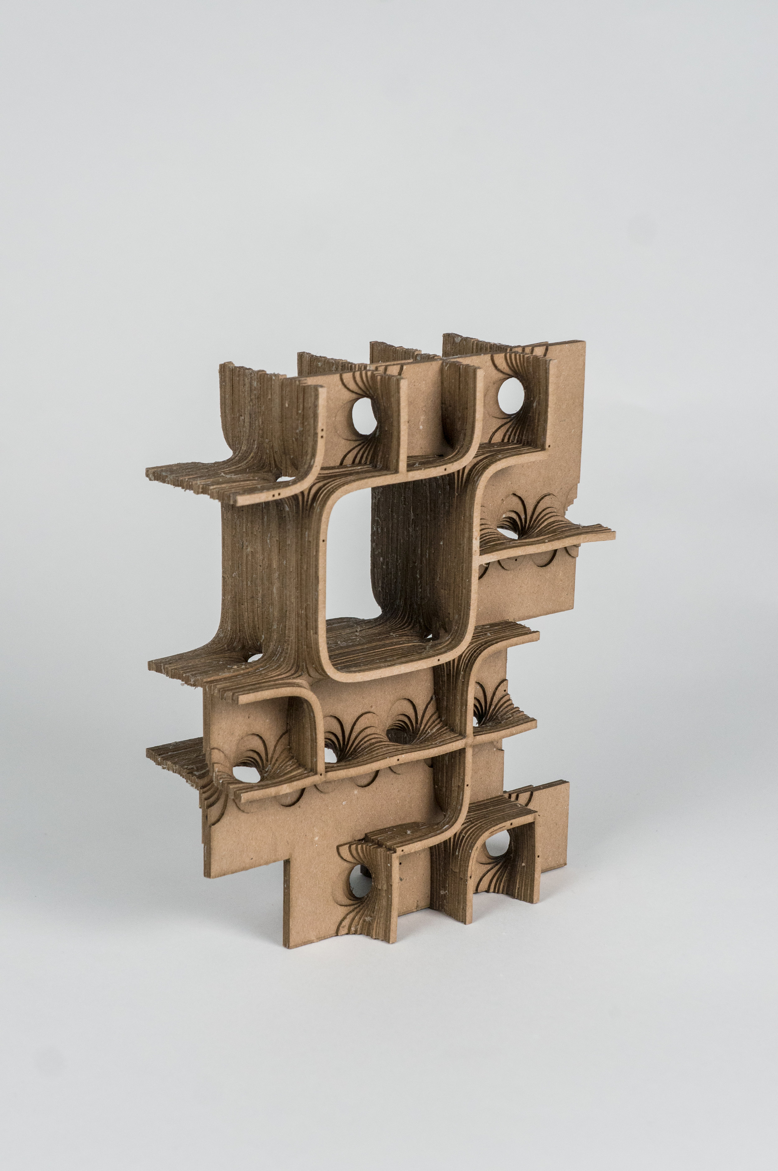
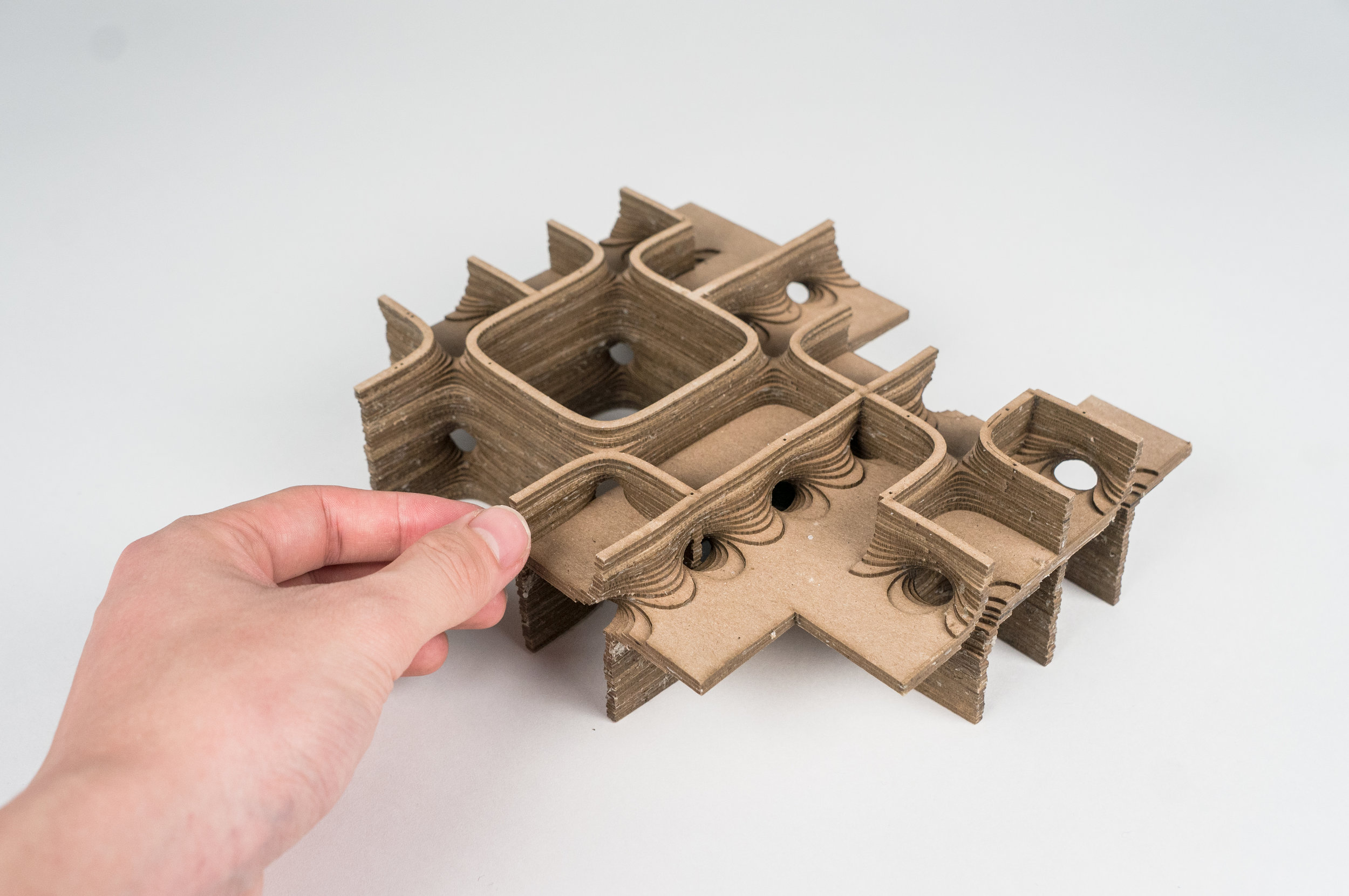
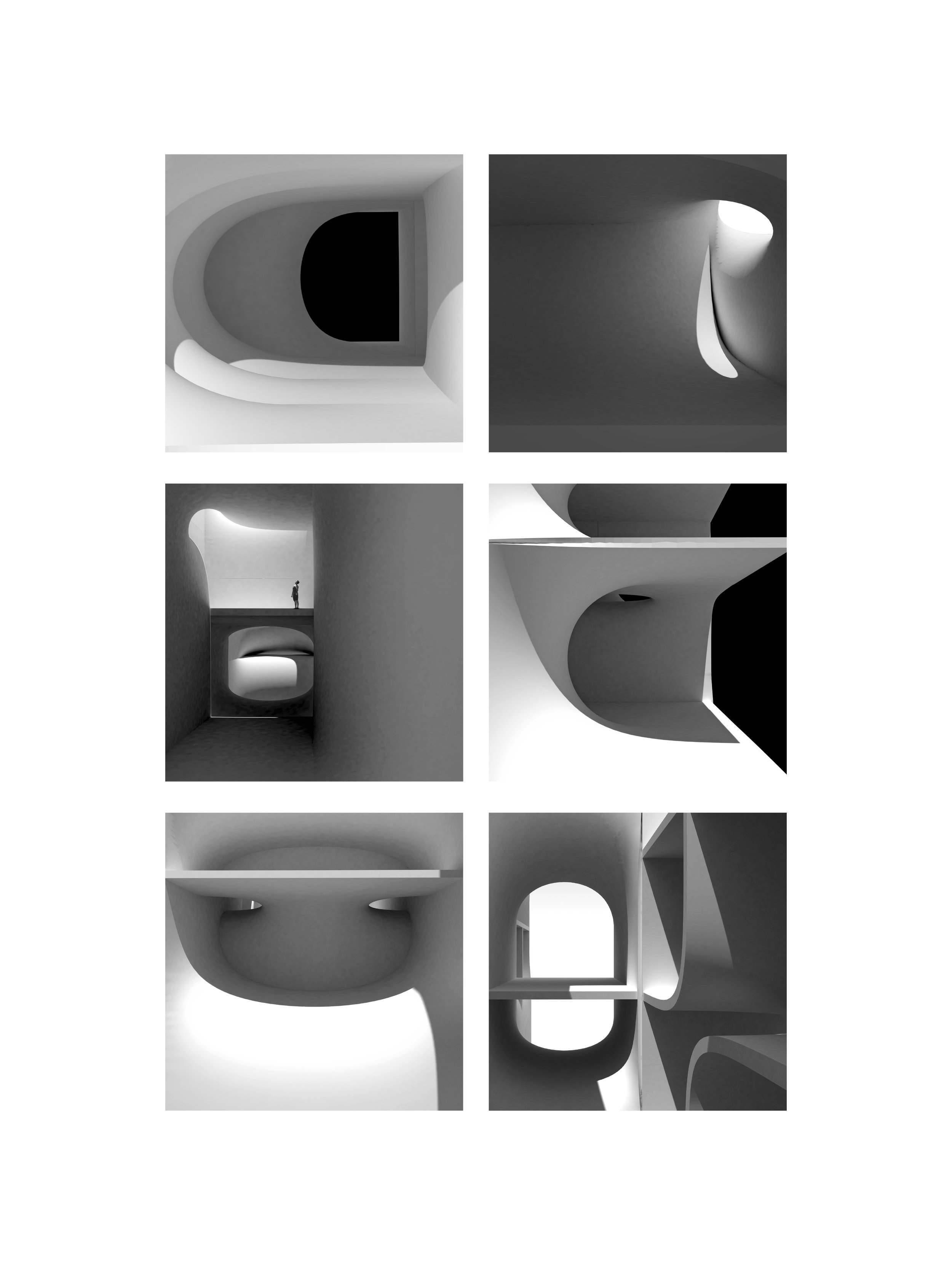
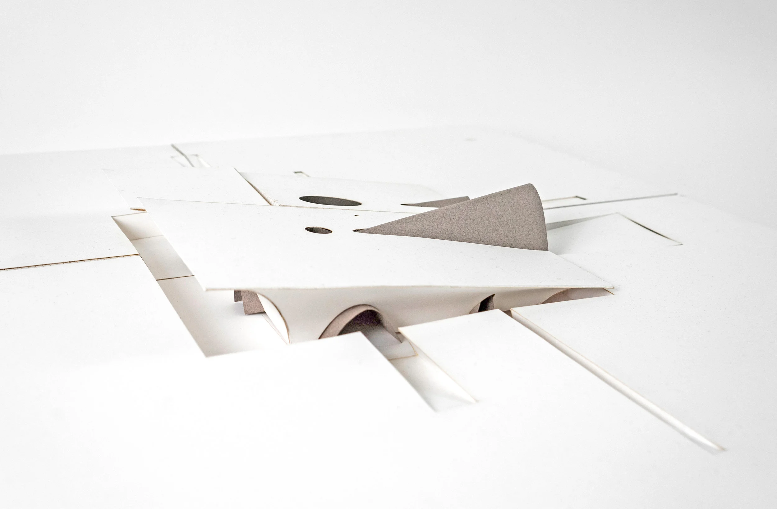
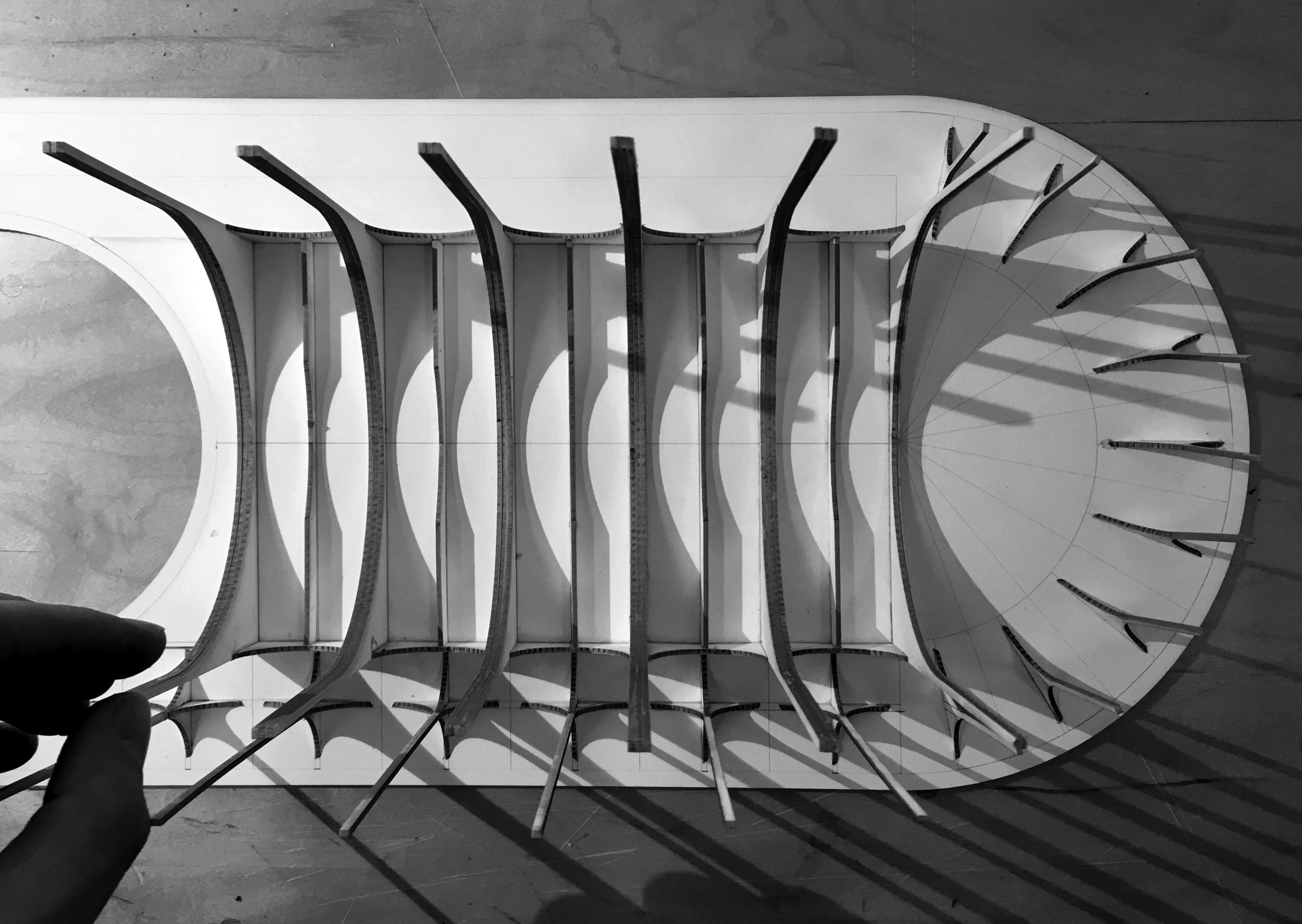
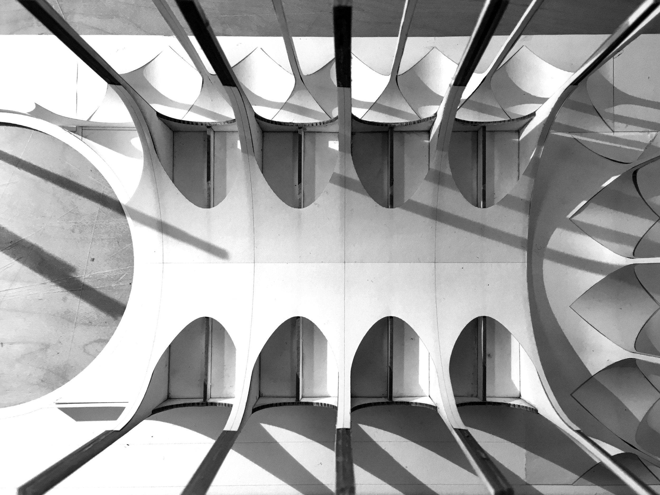
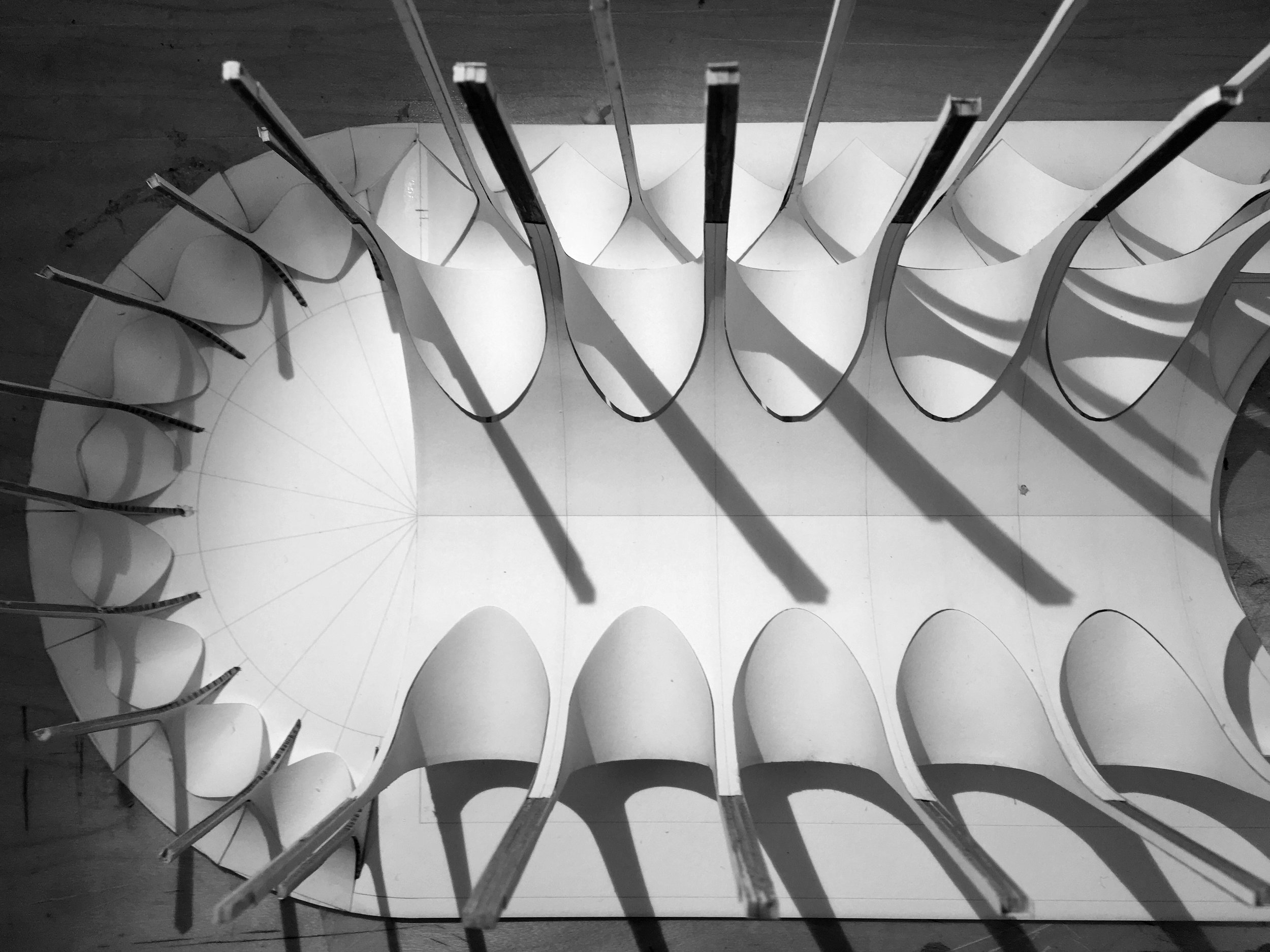
+URBAN LANDSCAPE / Harvard GSD/ Partner: Claire Djang
+GRAYSCALE / Master Thesis / Harvard GSD / Advisor: Preston Scott Cohen
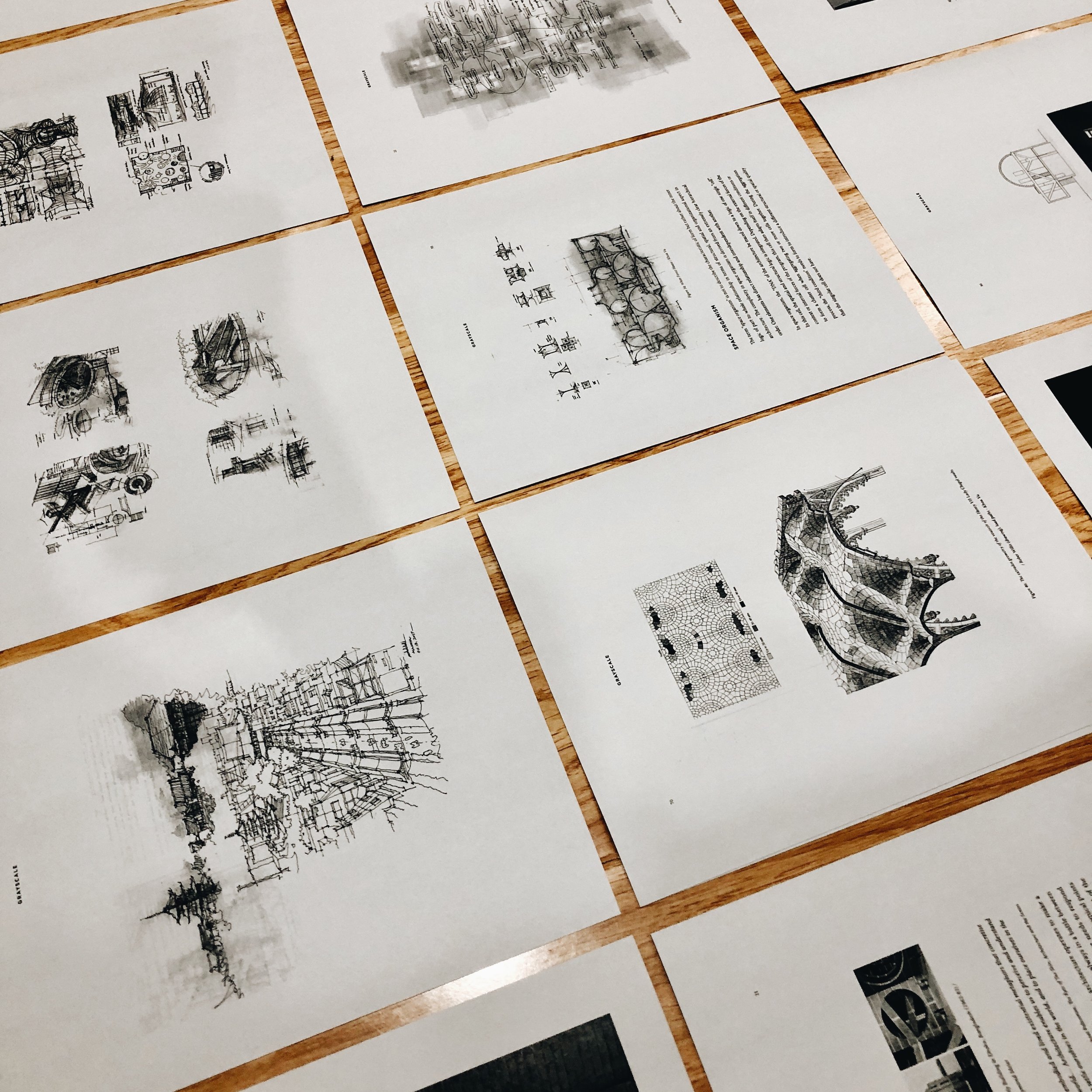
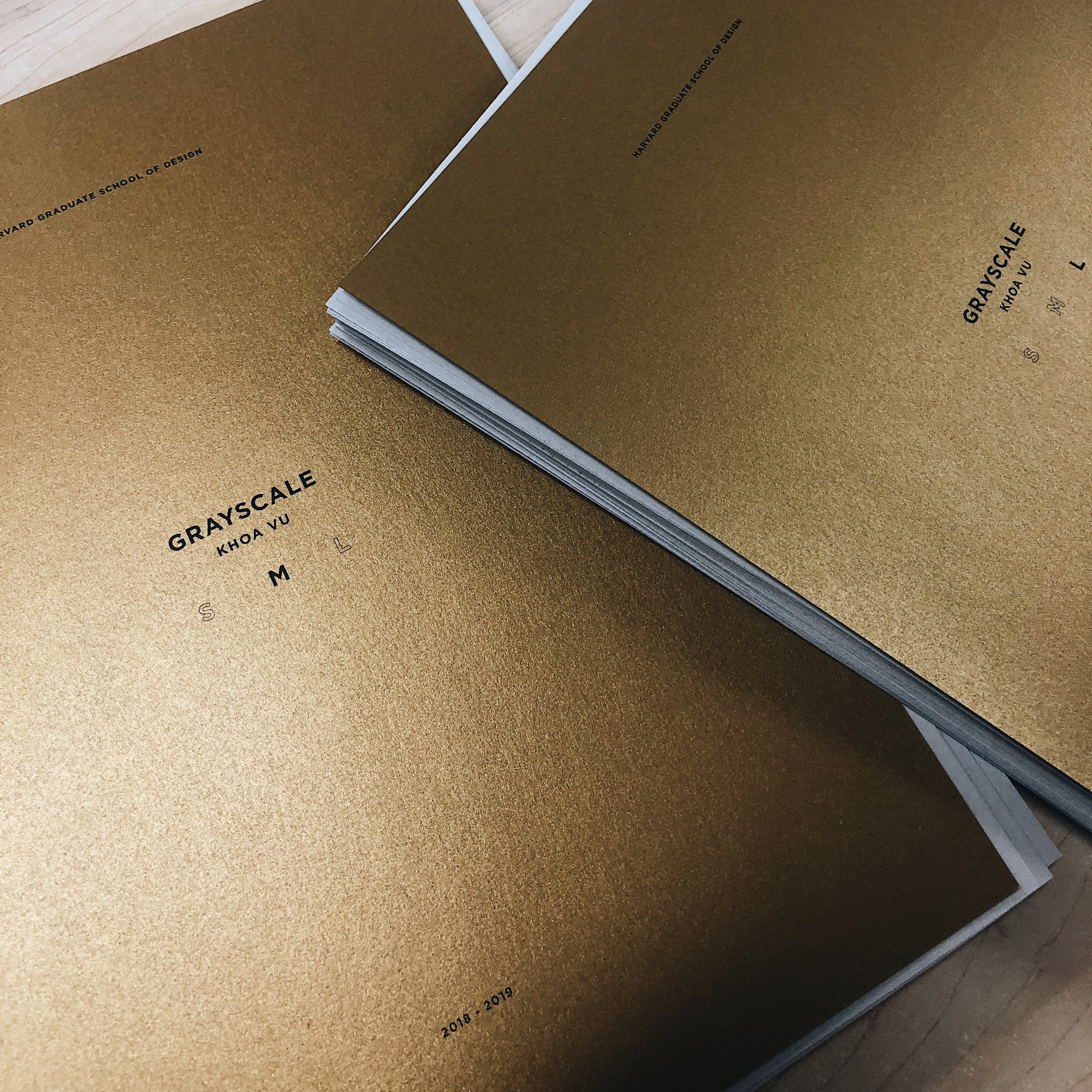
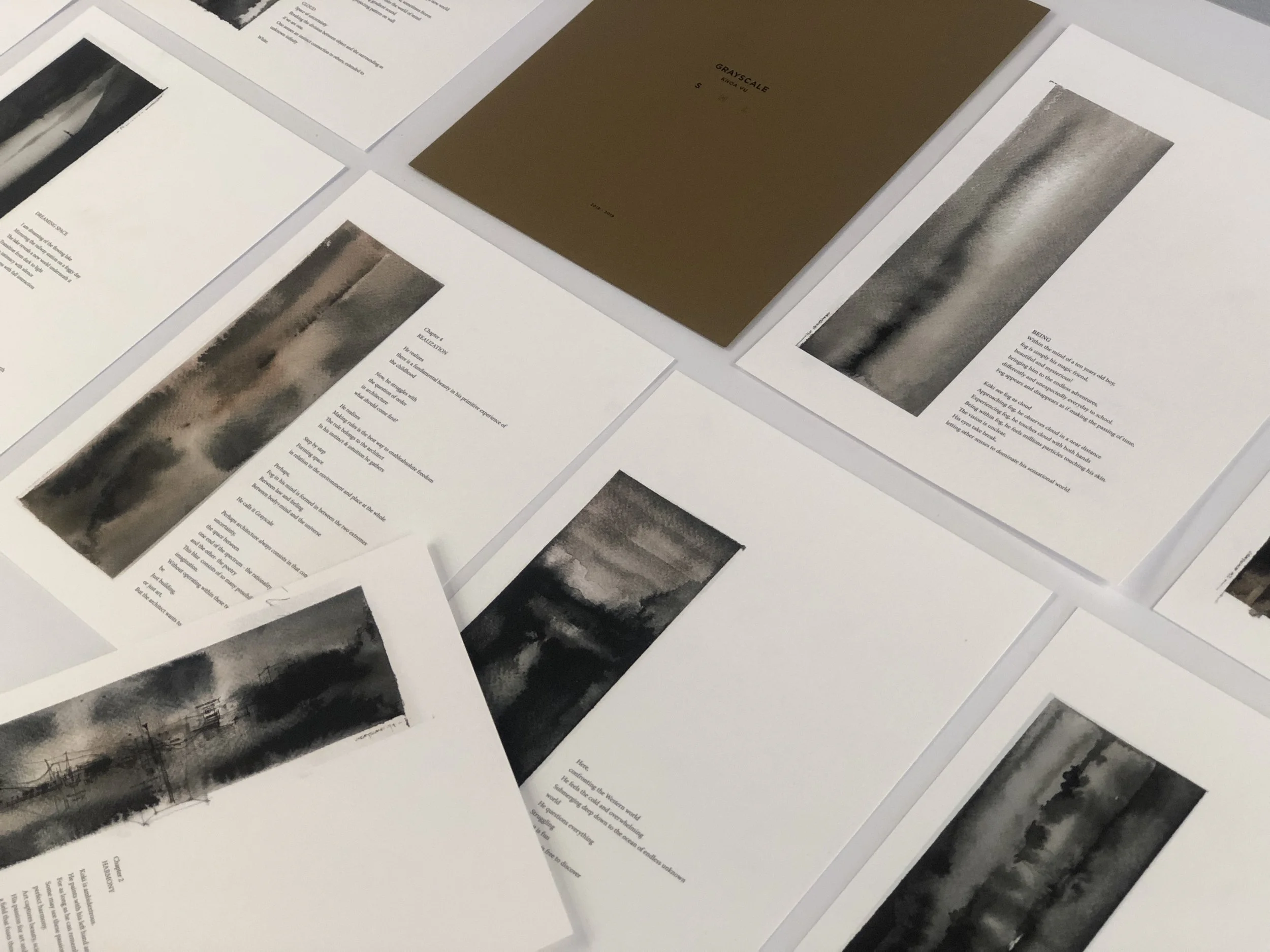
+GRAYSCALE S M L / Architecture of the In-Between / Publishing in Fall 2019
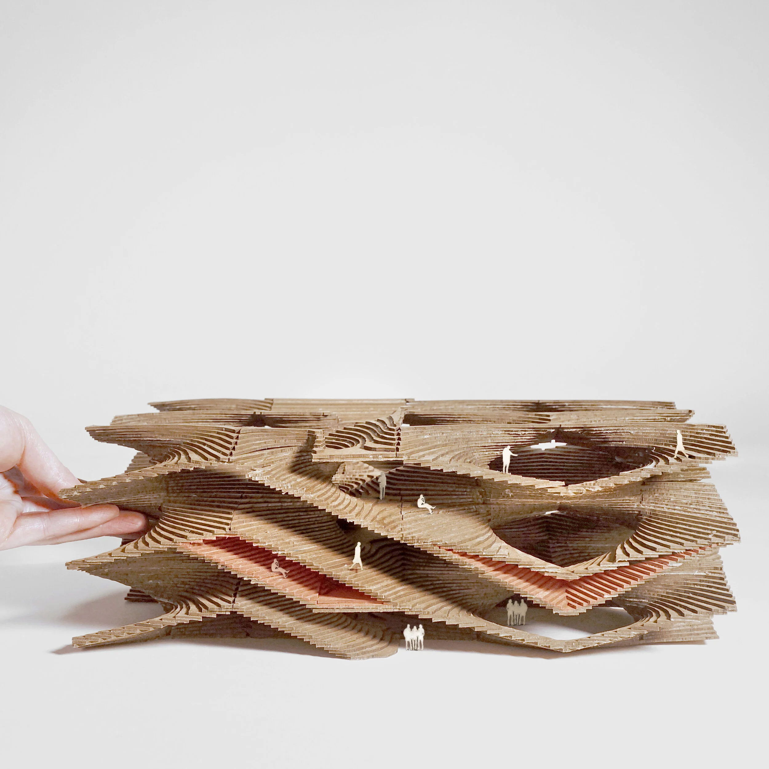
+SPACE ORGANISM / ETH Zurich / Advisor: Christian Kerez
+SPACE ORGANISM / ETH Zurich / Advisor: Christian Kerez
+Clouds & The New Columbia / New Dormitories, Columbia University, NY, USA / Studio's Preston Scott Cohen
+Clouds & The New Columbia / New Dormitories, Columbia University, NY, USA / Studio's Preston Scott Cohen
+Towards Spatial Poetry / Black Moon | Bath House | Crystal Lake, MA, USA
+Spatial System S M L XL (Partners: Wilson Harkhono)
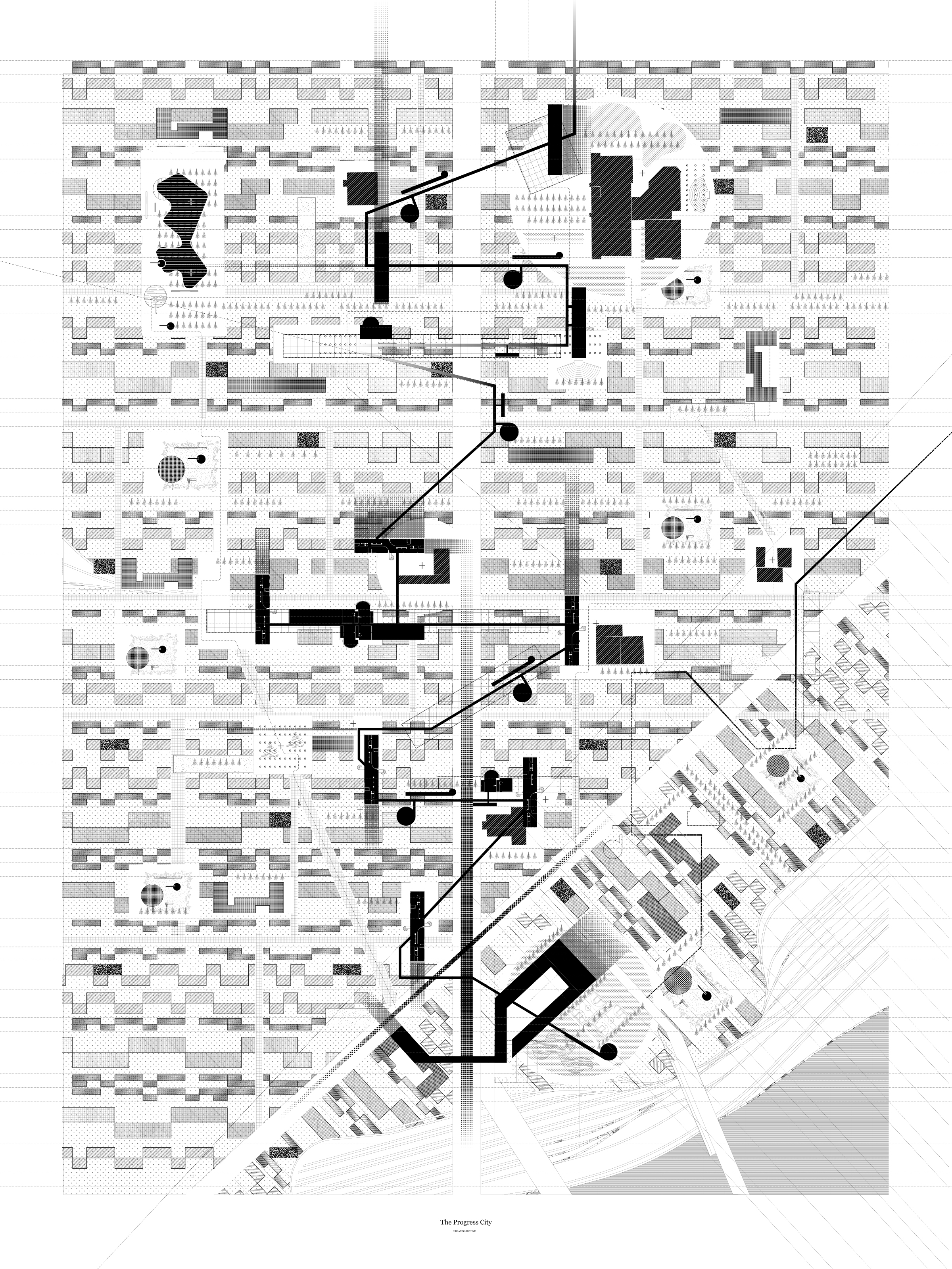
+Urban Narrative (Partners: Yue Shao & Luisa Sanchez)
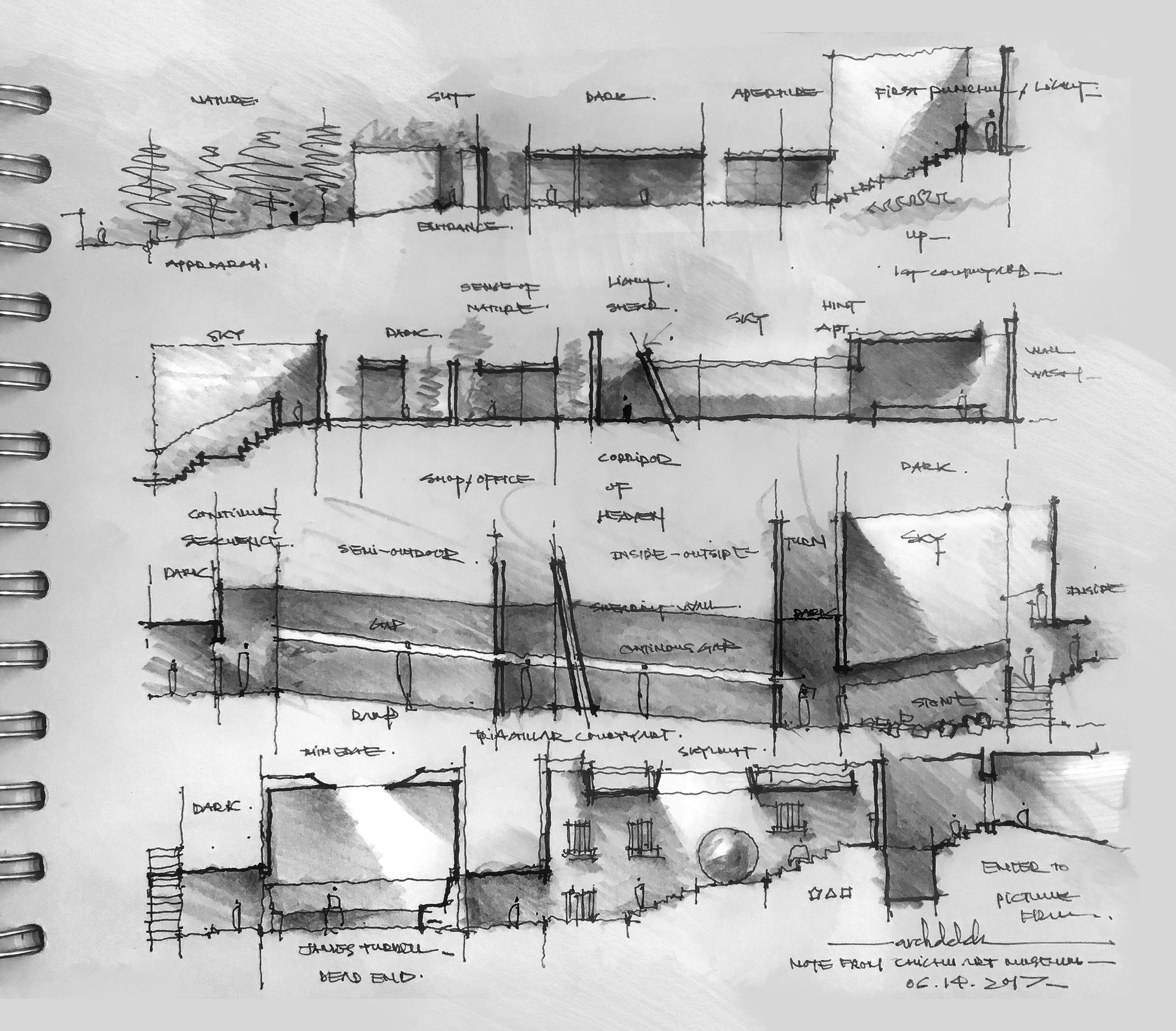
+Towards Spatial Poetry / Note from Chichu Art Museum, Naoshima, Japan
+Towards Spatial Poetry / Black Moon | Bath House | Crystal Lake, MA, USA
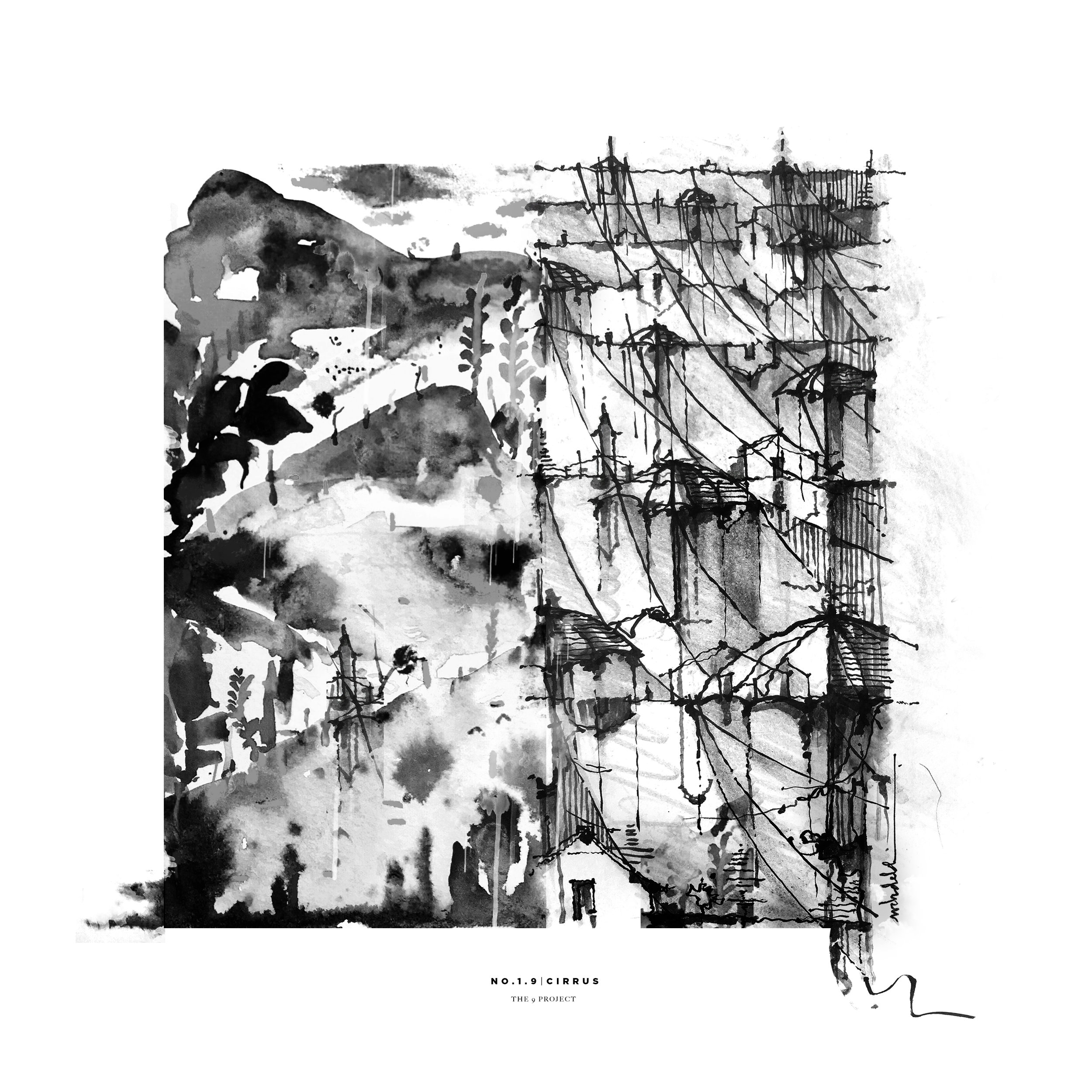
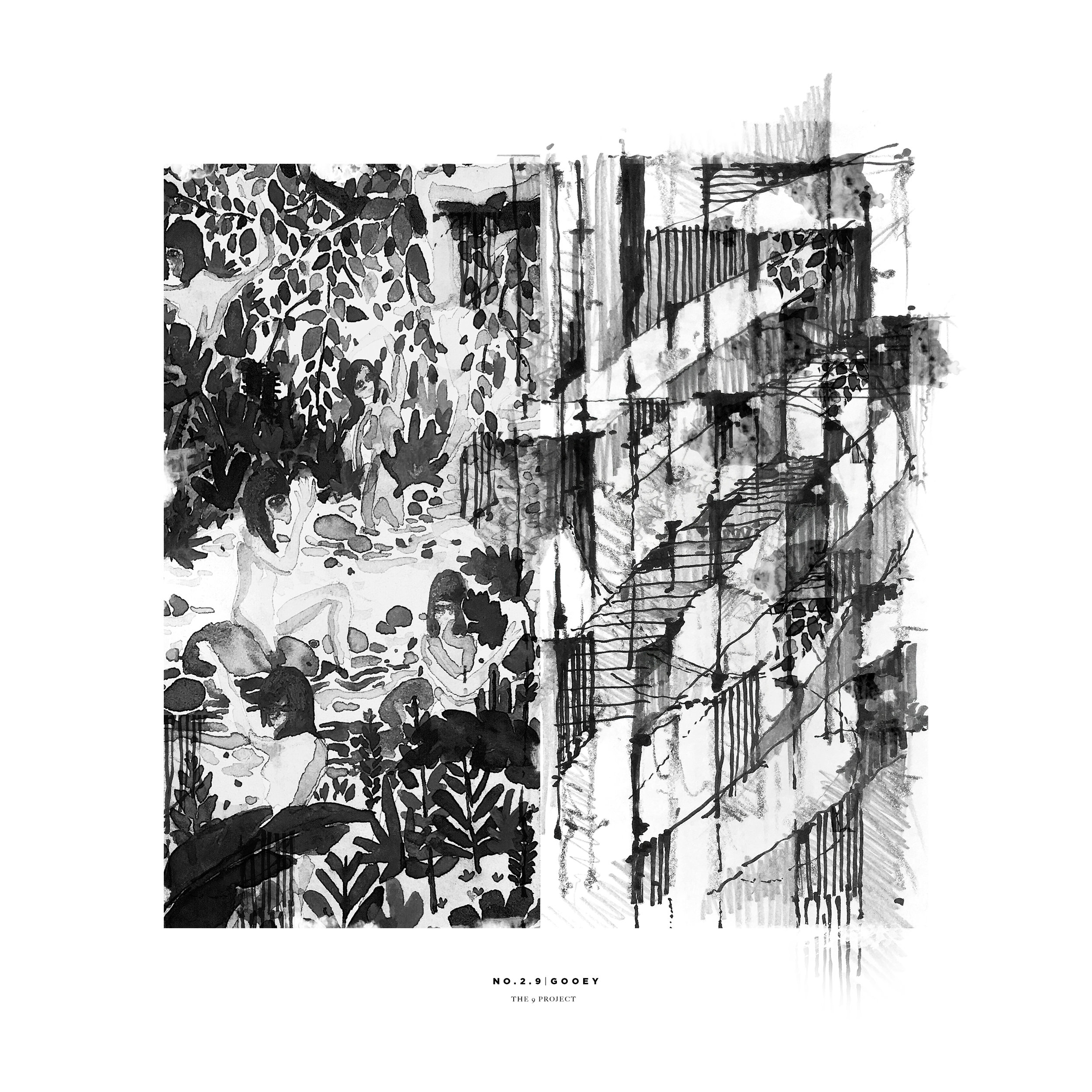
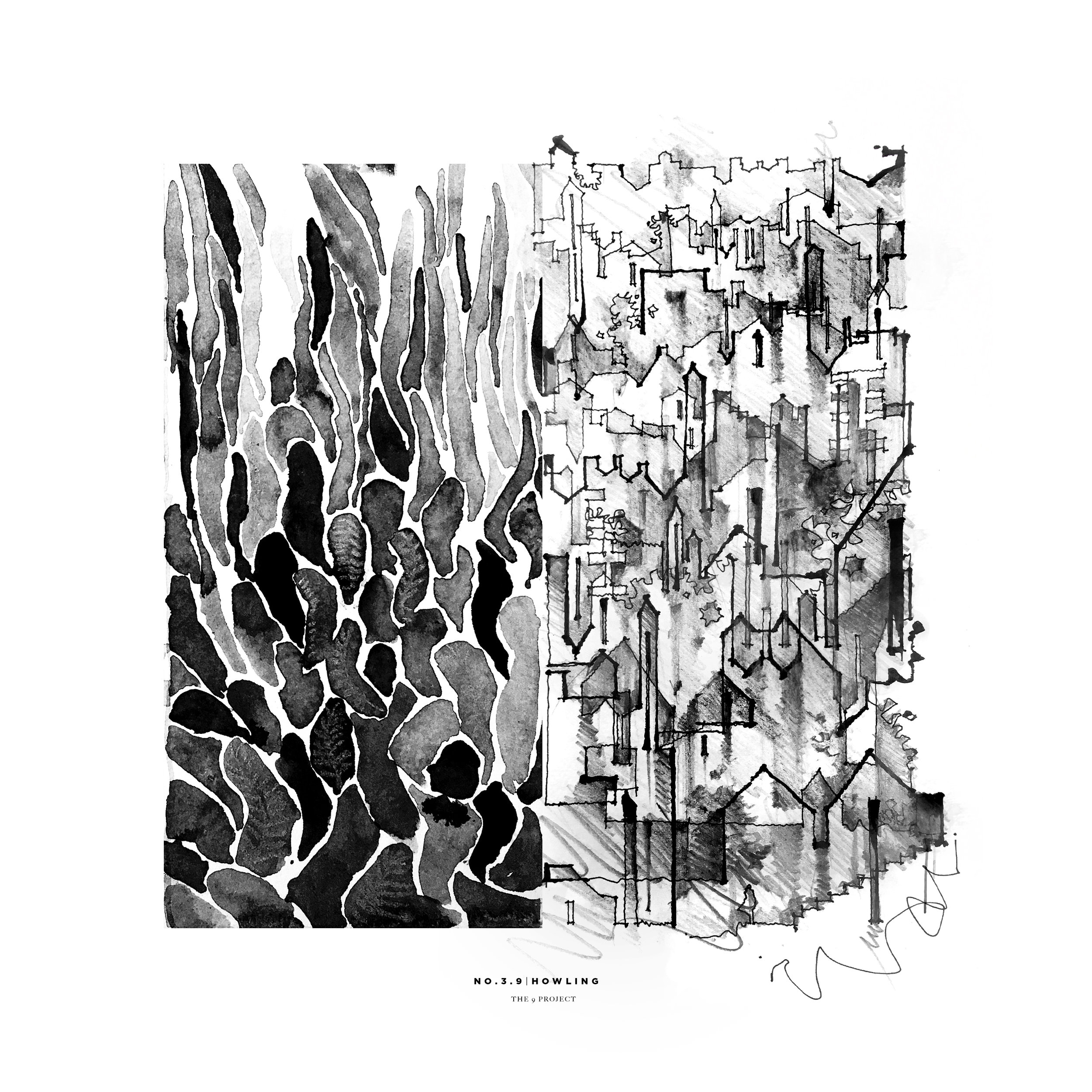
+Series / The 9 Project (Partner: Beining Chen)
+Series / Material System (Partner: Emily Ashby)
+Series / #002 (Partners: Yue Shao & Luisa Sanchez)
+Urban Series / #001 (Partners: Yue Shao & Luisa Sanchez)
+Urban Transfer / Fold (Partners: Yue Shao & Luisa Sanchez)
+Urban Transfer / Firgure Ground (Partners: Yue Shao & Luisa Sanchez)
+Perception / Toward Science of Spatial Poetry
+Within / InBetween/Veil/FigureGround/Forest
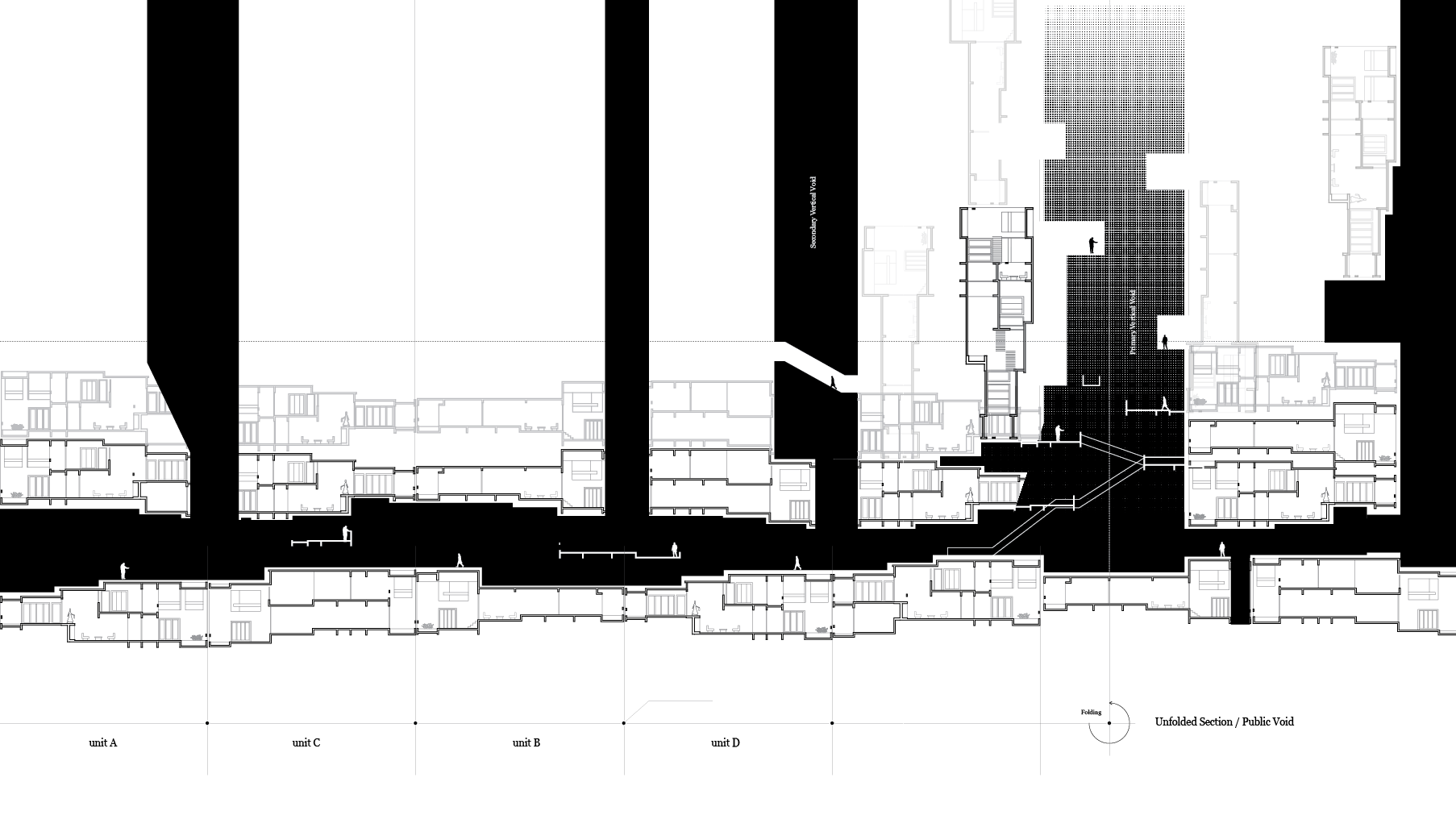
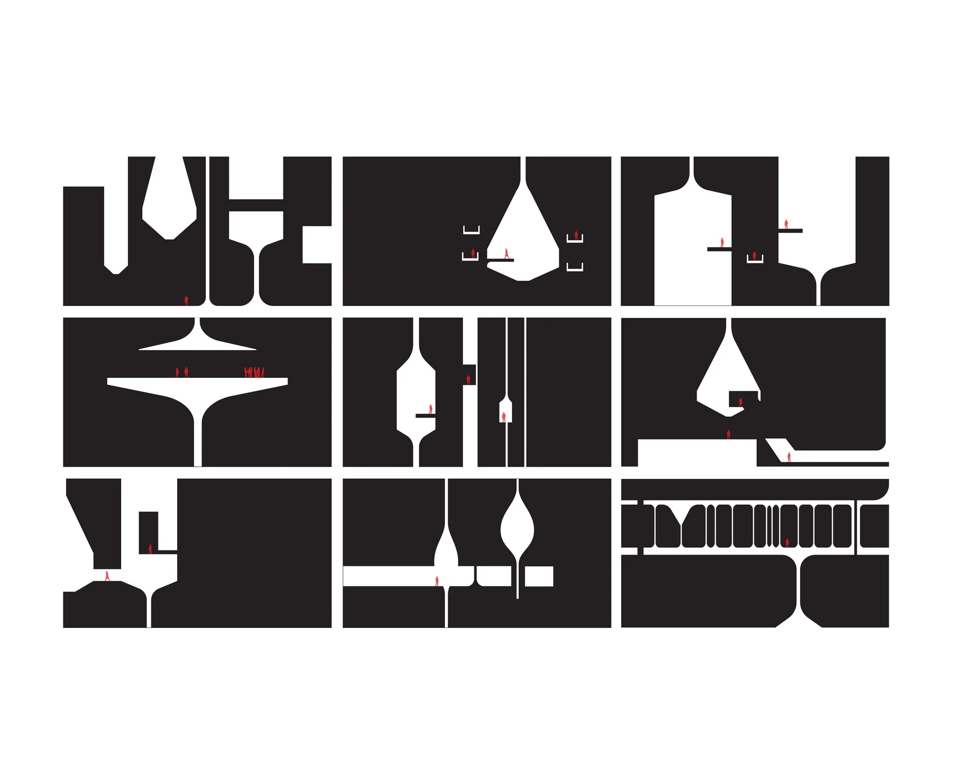
+ Spatial Sequences / Unfolded Sections
+ Fold / The White Forest
+ Duration
+ Micro Towers / Towers within
+ Elements / Towers Within
+ Oblique Field / Urban Landscape
+ Threshold #001 / Structural Bay
+ Threshold #002 / Form and Movement
+ Threshold #003 / Anti-Substraction
+ Landform / Intensive Extensive
+ New Orders
+ Fluidity
+Letter to Étienne-Louis Boullée
Dear Professor Étienne-Louis Boullée,
I am writing this letter to express my concern about the ability of architectural representation to convey the spatial and conceptual qualities of a project at the same time. How do such drawings engage the perception of the viewer? Regarding the set of pedagogic drawings that you have showed us in class, I was struck by the presence of both your concepts and the physical reality of the architecture within the same drawing. While plan drawings often describe the organization of the space, I find that the sectional drawings are significantly more important because they aim to reflect the spatial quality of the design. How does one achieve such a quality? What interests me is the balance between the level of abstraction and clarity coexisting in the drawing. It makes me question about where is the fine line between using drawing as a true presentation of reality and drawing as a device to convey conceptual idea. One of the drawings that impressed yet concerned me the most is the sectional drawing of Opéra au Carrousel.
I want to share my personal reading of the drawing with you in the hopes of making this concern clearer to both of us. Firstly, I think the drawing truly promotes the idea of making architecture expressive of its purpose. The drawing reflects effectively the functional aspect of the space - the notion of a public field in an interior space. As a design of a theater, architecture become a stage for performance. It relates to the specificity of the representation. In this regard, I also realize the importance of the notion of human figures appearing in the drawings. The fact that human figures are only visible at the central space and nowhere else makes the central performance space more active and dynamic. Also, the motion of the human figure informs the relationship and connection between the performers and audiences.
The second thing I have learned is there is a clear spatial organization and hierarchy expressed by the section. Without seeing the related plans, the section captures the stable and concentrated composition of the centralized organization of the design as it consists of a number of secondary spaces grouped around a large, dominant, central space.
To dive deeper into the principles of composition and hierarchy articulated in the drawing, I am interested in the idea of challenging architecture by the play of visual scale. What is vast, what is small? The notion of visual scale, which refers not to the actual dimensions of things, but rather to how small or large something appears to be in relation to its normal size or to the size of other things in its context. A space can dominate an architectural composition by being significantly different in size from all the other elements in the composition. By composing a large unified space next to secondary small space, it make the performance space feel even larger. It strengthens the hierarchy of the space and especially gives a sense of monumental expression of the design.
By drawing attention to the central field of the space, the drawing truly captures the sense of layering which relates to the operation of the opera house. One of the main problem with opera house is the flyspace. There has to be a large area above the stage into which elements of the set design can be lifted to change scenes during a performance. At first, I wondered where the flyspace was. I was surprised to find that your solution was simply to design on a scale large enough to encase the entire auditorium, stage, and flyspace in a single unified domed structure. It makes me excited when I am not only amazed by the atmospheric quality of the space reflected in the drawing, but also able to understand the practical and functional aspect of the design from it. Through principles of composition, the play of the scale become more reasonable in relation to the operation of a believable opera house.
Aside from the play of scale, there is a level of abstraction and simplification in the drawing that promotes the idea of coherent hierarchy and order in architecture. It relates to my question of what do you want the viewer to see first on your drawing? As an architecture student, it makes me aware of being able to control the drawing to effectively communicate the idea to the viewer. Aside from the central performance space, everything is simplified to the most fundamental and clear forms of arches and vaults. I wonder if it is your intention to simplify all of the detail of the secondary space as much as possible to create the contrast with the central performance space that is full of details and articulation. If so, does this simplification operate as a technique of representation to achieve a hierarchy effect or does it actually describes the reality of their physical appearance.
What I have learned is that the notion of hierarchy can be effectively communicated by experimenting with different techniques of representation. By using the figure-ground relationship, the central performance space becomes more prominent to the viewer. Our perception and understanding of a composition depends on how we interpret the visual interaction between the positive and negative elements within its field. What fascinates me most is that all of the secondary spaces are being blacked out and left blank which give a huge contrast between the adjacent spaces and the central performance space. The darkness of the interior makes it impossible for the spectator to judge the size of the room. However, while I am convinced that the darkness of the secondary spaces bring the focus to the main performance space, I wonder if that technique sacrifices the reading of the relationship between the spaces within the design. In the section, is it not also important to express the sequential experience of how one moves through different spaces within a building and how one moves from the outside to the inside?
The drawing also makes me think of how the architect can challenge conventional drawing in architecture and begin to explore and experiment with new types of representation. Aside from the play with scale, simplification technique, and figure-ground relationship, I am equally excited by the way you superimpose the two-dimensional drawing and the three-dimensional sectional perspective drawing together. While the overall drawing seems to be two dimensional section, the vast central performance space suddenly turns into one point perspective which provides significantly more depth and layers of information about the space that a section could. Within that perspective, there is a play of framing and layering that makes the space extend layer by layer into infinity. The drawing makes architecture become the stage of performance with a series of backdrops; vault intersecting with dome, continuing with vault again unto infinity.
I was also curious about your rendering technique through a series of ink and wash drawing. The depth of the drawing is also achieved by the play of light and shadows, the idea of mass and light are conveyed effectively through the purity of form. I think this quality of the representational rendering actually engages the perception of viewer in the way of it captures the atmosphere of the space -light, shadow, depth, etc. - rather than simply the physical architectural form.
There are specific characteristics of the space that you express in your drawing. For instance, the notion of darkness and light, the expression of purity, power, and infinity. Through these, I think when we begin to ask the question of how to architecturalize these kind of characteristics, the level of abstraction will inevitably come into play and challenge the physical presence of the forms.
To further deepen my concern about experimentation through architectural representation, I hope to use different types of representation to explore the relationship between spaces and the various elements of architectural form. In the Opéra au Carrousel drawing, the way you superimposed the two-dimensional drawing and three-dimensional perspective drawing together to convey the idea, the use of figure-ground relationship are fantastic examples of this sort of experimentation.
The role of drawing in architecture nowadays does not challenge us enough to push boundaries and question us, as architectural designers, about the relationship between the real and the reimagination. In your drawings, I see questions being raised about how we can represent the unrepresentable; how to draw the atmosphere of the space. I think those are very important questions to push me further in exploring my designs through the choices I make about how to represent them.
To me, in the end, architecture is a representational discipline; we design it but we do not physically build it. Opéra au Carrousel is a strong example of how a single drawing can communicate the essence of a project. In school, we tend to be overemphasize the practical aspects of the design; that the drawings have to truly describe the reality of the design. We somehow follow the drawing conventions that have been developed in the past and often forget to question about how to look at the drawing from a different perspective. Your drawing really made me think about how experimenting with representation in a single drawing can cause new architecture to emerge that otherwise would have remained unrealizable had you merely treated the drawing as a technical document.
Write here...

